#3 – The benefits of white space
I love add-ons, those little programs that allow developers to add features to a video game. When I play my favorite game – you already know which one it is – I always download a bunch of them, until I reach the point of no return, that moment when there’s no more free space on the screen. This space, which I fill pixel by pixel, is called white space.

Filling the screen in this way inevitably has consequences:
- it takes much longer to find the information you’re looking for
- important elements are lost in the shuffle
- the interface seems poorly organized, with more chances of making a mistake
In short, the game becomes messy, if not completely unreadable. In this article, we’ll look at the benefits of white space, and how we can use it to enhance our interfaces.
What is White Space?
Also called negative space, white space refers to the space that exists between design elements. From the margins of our screen, around our logo or the main call to action… This is what we often call “Macro white space”, which is as important as “Micro white space”.
The micro white space is the space between minor design elements, such as the space between two typography glyphes, or the space between two lines of our paragraph.
Game designers from CupHead, a stunning game with old-school art direction, have managed to use just the right amount of negative space between major and minor design elements.

Although named “white space,” it doesn’t have to be white; it can be any color, texture, pattern, or even a background image.
The expression comes from graphic design field, where printing methods typically involve using white paper. The concept of white space can be seen as an integral design element, rather than simply an empty space.
“White space is the area between design elements”
Is white space wasted space?
It’s a recurrent point of disagreement between designer and their customers.
While we may see white space as a manifesto of elegance and clarity for our players, many people mistakenly believe that it is a waste of space that needs to be filled.
“There’s still a space there, so let’s put a button!”
If you’re a musician, this reference may speak to you: my music-lover friends, Tanguy & Guillaume, recently told me about what we call “silences” in music.
And in my mind, it immediately sounded familiar.
“In design composition, white space functions in the same way as silence in a musical composition. Without proper use of silence, music lacks structure and can be perceived as noise. Design also lacks structure and becomes challenging to comprehend without the proportional incorporation of white space.”

Why does negative space matter, and how to use it?
Designers incorporate white space as a fundamental component of their design, with valid justifications. Clever use of white space has the potential not only to improve the design itself, but also to enhance the overall user experience that the design aims to deliver.
In other words, white space considerably enhances not only the user interface (UI), but also the user experience (UX) of the game.
Let’s take a closer look at the advantages of using white space:
Guide the user through logical grouping
Do you know Law Of Ux website? It’s a collection of best practices that designers can consider when building user interfaces. One of them is the “Law of proximity”, which states that “Objects that are near, or proximate to each other, tend to be grouped together.”
White space makes it easy to achieve this effect, as the designers of Destiny:

Focusing where it matters
A good interface (or a good designer?) should be able to guide the user attention where it’s needed. While it’s easy to over-design, it’s hard to create a clean interface. I’ve once heard that a good design is done when there’s nothing left to remove.
Take a look at this screen of Genshin impact: by using a good amount of white space, designers give the focus where they want to:
- First, the character design
- Second, item name and description
- Third, action button
It gives an impression of calm and cleanliness, isn’t that perfect? This feeling brings us to our next point, branding and voice tone.

Branding and Tone of Voice
A chill sand box game with quiet place is not designed like a first-person shooter with loud guns. We tend to associate large amount of white space with luxury and sophistication (think Apple), so skillful use of these spaces can be a way of incorporating these associations into your design.
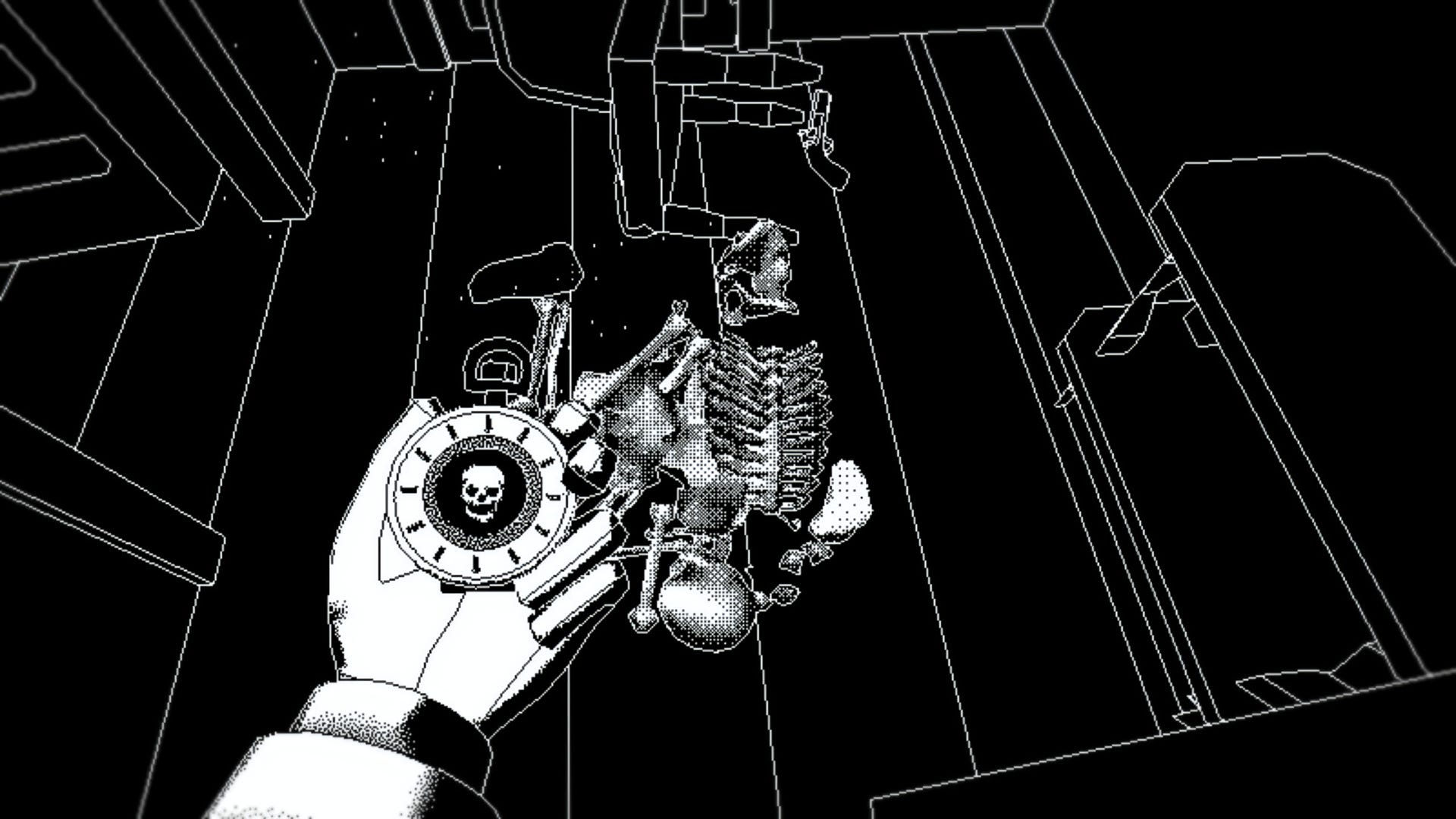
Just like Return of the Obra Dinn, a first-person mystery adventure based on exploration and logical deduction, did.
The game is entirely based on the player’s vision and graphics, and that’s why the interface is… almost empty. It perfectly matches the gameplay and spirit for which it was designed, creating breathing space for the user, leaving him with no distractions other than the game itself.
Conclusion
Don’t be afraid, white space is certainly not an empty space, but a powerful tool in the designer’s hand. We can use it to balance our interfaces, bringing harmony in our game. It will also help us showcase our brand and tone of voice in keeping with the spirit of the game. There are different types and uses for negative space, learn how to use them, and you’ll attract the user attention more efficiency, while making his or her journey easier.
Source: The power of white space, Importance of white space in design, Importance of white space in good design, How to use white space, White space in design, Negative space in design: tips and best practices

Links worth visiting
- Worthy game marketing tips – from Jacky Martin, founder of Gentleland
- Atypical design – at the crossroads of pixel art and 3D, you’ll love to see it
- Game UI Data base – The ultimate reference tool for interface designers
- Pixel art tutorials – you must have seen it at least once if you use pinterest
- 150 icons in pixel art – grab this polished pack for free
- Daily pixel art and gaming news – packed in an amazing website
- 100 simple truths – life is short, take a breath
- UX newsletter – where I find a lot of ressources and ideas
- How to market your indie game! – by the creator of ISLANDERS
- Best practices that designers can consider – when building user interfaces
You want to share a link about video games, interfaces, game dev or design? Let me know.