#2 – How to make a good text field
I recently organized a LAN, to relive my childhood memories of playing Star Wars Battlefront 2 (2005). Apart from the fact that the game is just as I remembered it, and I had such a great time, I had the misfortune to come across a poorly designed text field.
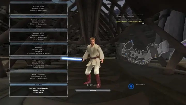
The upside is: it gives me an excellent subject for my newsletter. The downside is that, with the absence of details on how to understand it, it generates a lot of frustration and wastes time.
Let’s take a look today at this age-old element, from the first Pokemon on Game Boy Color to the latest Diablo, which is all too often poorly executed.
A good text field is displayed at the right time
A good text field is also a text field that doesn’t exist.
Silly, but true. If we don’t need it at the time, or if we have a better alternative, we can do without it. It’s all a question of situation, of learning what type of elements to display to our players.
To better understand this, let’s look at a few alternatives based on good UI practices, that can be found in Apple and Google design guidelines.
The toggle switch, to activate or deactivate an option
If our player needs to activate or deactivate an option, the “toggle switch” component is the most appropriate. We can find it in almost options of our favorite video games.

The choice list, for questions with few options
Need to answer a closed question with less than 5 options? You can quickly and efficiently display a list of available choices.

Radio buttons or checkboxes, it all depends
Radio buttons are used when the player has to choose just one option in a closed question, contrary to checkboxes, that allow you to make multiple choices.

And every others
Select, Multi select, Textarea, Range, Search… we won’t go into details here, but all the variants that exist are options we can use to enhance our forms and replace text fields.
Let’s just remember that, given the situation, it’s not necessarily a text field that should be used. It’s often tedious to write in, and errors are legion – we’ve all experienced them on our Game Boy or Playstation.
A good text field has clear label
Creating easily understandable label text represents one of the main techniques for enhancing the accessibility of user interfaces. Labels communicate the function of a particular field, make them short, precise and don’t over use technical language.
A good text field don’t use placeholder text as labels
Many designers have been using this technique to save space in their interface.
One of the problems with using a placeholder as a label, is that the text doesn’t remain legible once the field has been filled in. Another reason is that many text readers won’t find anything to describe to their owners, leaving them in the dark.
Use a placeholder to show how the text should be formatted in the input, like a phone number or a credit card, not as a label.

A good text field is used wisely
Its main function is to retrieve a string of characters, but here’s an interesting use: prevent the deletion of something important.
In World Of Warcraft (again), when you want to delete a character or a rare item, a text field appears.
You must then write “Delete” inside to complete the action. This is a good way of preventing errors (if you forget the infinite monkey theorem).
However, beware: this solution quickly becomes annoying if used too often. Let’s save it for important, infrequent moments.

A good text field have affordances
If this is the first time you’ve seen this word, don’t worry, because here’s the definition:
Affordance is the quality or property of an object that defines its possible uses or makes clear how it can or should be used.
The visible handle of a door, the pressed button of a switch or the marked border of an input – these are all elements that can show afforance.
The first time I saw this word was in the book “The design of everyday things”, which I recommend.

Our text fields should be easy to distinguish, leaving as little ambiguity as possible to their purpose. In practice, they are rectangular, with a marked outline, a background color and a label in the top left-hand corner.
Let’s take existing codes, reuse what our users know and are already used to.
Sometimes, it’s a question of size
Speaking of affordances, we also need to think about the size of our text fields.
If the response we expect from our players is, for example, a nickname limited to 10 characters, then we can calculate the maximum width of the input.
In this way, seeing its restricted size, the user receives an indication that the expected response must be short. Conversely, an elongated field suggests that the result may be long.
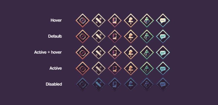
A good text field gives visual feedback
What we’re talking about here, the text field, is known as an interactive element, simply because the user can use it with a mouse, a keyboard, a joystick or even a banana.
To show that it’s interactive, enough visual cues need to be added at key moments, subtly changing its style. It’s important to keep everything discreet, the aim is to orientate the user.
Here’s a closer look at the four main status changes we need to think about:
The hover state
This state is triggered when the cursor passes over the interface element in question.
The mouse cursor usually changes at this point. In addition, it’s often a good idea to change the border color as well as the background color.
The active state
This state is triggered when the element is clicked.
For form text fields, it’s not the most visual, so we can put it aside. But if you’re designing buttons, this element is very important to show that a click occurs.
The focus state
This state is triggered once we’ve clicked on the element and persists until we click elsewhere, or press the “esc” key for players with a keyboard. It is used to show the user which element will receive the text.
Visually, this state often comes with a change in border color and a lighter background color.
The (so dangerous) disable state
This state is used to prevent our element from being interactive. Although it can be useful, users often have more questions than answers.
Why is it deactivated? How do I activate it again? Will it last long? Have I missed something? Did I made a mistake?
For this reason, it’s advisable to not overuse it, and to add the necessary information to help users understand what is happening.
Here’s a gif from our turn-based game’s buttons, showing the 4 states mentioned above.
A good text field can be set on autofocus
This is our final tips for this article: if the next and main action available on the screen is a text field, save a click and activate autofocus on this field.
In conclusion, there’s a lot to be done
Yes, creating a good text field takes a lot of time.
But if these elements are part of our games, then we need to make them as easy to use as possible, because player satisfaction is crucial to the success of our projects.
There are so many other tricks for making our text fields frustration-free, we wouldn’t have time to list them all here. We’ll probably do a follow-up to this article in a few months.
Links worth visiting
- Maneki Social – daily social media tips for solo game devs and indie studios
- PlayAbilityTech – a new project to emulate an xbox controller with its wheelchair joystick, facial movements, various accessories, etc.
- GM Shaders Mini: CRT – do you remember these old, fat, curved TVs? Xor made another tutorial to recreate them
- Pixel art inspiration – as we love it, by Philtacular
- YellowAfterLife – must have tutorials and technical posts for Game Maker Studio on this blog
- Nintendo registers numerous new patents – game mechanics, such as a loading screen sequence, can be legally protected patents
- Baldur’s Gate 3 – is out, and with it comes a whole set of interfaces
- Gamescom – are you ready for the biggest gaming event of the year?
- Pixquare – a new pixel art editor on iPad and iPhone
You want to share a link about video games, interfaces, game dev or design? Let me know.