#4 – Build a powerful pagination
Running across the Ganon-infested plains of Hyrule, your gaze is drawn to an azure colored flower. As you frantically press the button to retrieve the loot, it instantly disappears into the depths of your inventory… Open it, and you’ll discover a collection of all the items you’ve collected during your adventure: food, drinks, equipment, weapons and so on.

As your bag grows, you end up storing tons of items of varying importance, and you’ll soon have to deal with a common but dangerous ennemy: paging.
Between inventory and leaderboard, learn how to create effective pagination.
What is pagination and when is it used?
Pagination is the process of dividing a document into discrete pages, either electronic pages or printed pages – Wikipedia
Let’s also describe an important term, “design pattern“, which you will notice repeatedly in my article:
A design pattern provides a general reusable solution for the common problems that occur in software design.
As our visual and cerebral capacities are *sigh* limited, we can only process a small amount of data at a time. Pagination attempts to solve this problem by diluting information in different sections.
Depending on the type of game, below 20 – 30 items, I don’t think it’s necessary to filter or paginate things. If you are not sure, some user research can help you retrieve pain points, and understand the problems your players are experiencing.
In short, to answer the question posed a few lines above, “pagination” is a design solution that’s needed when there’s too much information. A solution that Skyrim’s designer decided not to use, leaving us to scroll through the inventory looking for items we don’t yet have: the famous Ysgramor’s Soup Spoon.

The benefits of pagination for the user
In UI design, pagination is primordial to facilitate navigation and access to information. It offers players a clear pathway through items, making it easy to locate a specific one.
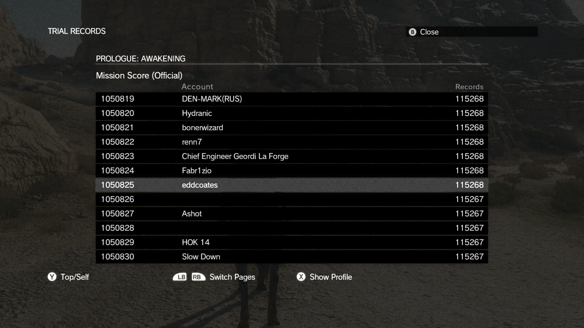
There’s another hidden advantage to using it: in a game where you can have an unlimited number of items, such as online leaderboard, paging allows you to load only the next 10, 25, 50 (or any number you choose) elements. Instead of loading the whole inventory, you’ll get it piece by piece, which saves a lot of data.
Think of the 1,175,988 results for this Call of Duty screen. I’m glad that pagination has also reduce the number of API calls needed to load it.

Tips for making a good pagination
Now that you know the whys and wherefores, let’s dive into the tips that will help you improve your interface.
Pagination vs. infinite scroll
If you’re stuck in the toilet, eyes glued to your smartphone, scrolling through profiles of perfect stangers on social media, then you know what infite scroll is – the opposite of pagination.
If you are making a mobile game, you may be asking yourself this question: “Should I use infinite scroll or pagination?”. There are few examples (if any?) where we should use infinite scroll instead of pagination in inventory or leaderboard.
Although it has its own advantage, such as:
- Smooth, uninterrupted browsing experience
- Ideal for mobile devices: touch-friendly, reducing the need for precise clicks
- Works well for content discovery experience, like social media
Pagination is the best way to find and remember the precise location of an element and control the interface – which is what we’re looking for here.
Place it correctly
The location of pagination is important from the point of view of user-friendliness. In the vast majority of cultures, you scroll from top left to bottom right. For this reason, it’s advisable to place the pagination at the bottom of the list to which it belongs, in the direction of reading.
This is a special case, but if your screen is huge, you can place the pagination at both the top and bottom of the screen. This reduces the risk of forgetting the pagination.
Example taken from Warhammer, where the design pattern is well placed at the bottom of the list.

Next, prev and go to buttons
Yes, we have to show our players how many pages they can browse. But above all, in addition to the basic previous and next buttons, we need to give them a way to quickly access the first and last pages.
If there are a lot of results, we can help them to be more specific, and add a “go to page X” button. This can be an special case, especially in a leaderboard where I find it hard to understand “why my user wants to go, exactly, to page 53”, while I understand the need to see the first (leader) and last (bouh! losers) pages.
Taking example from Valorant designer, who provides a go to first and go to last when displaying the leaderbord.

States and actions must be properly visible
Speaking of buttons, let’s think about the states. Give clues, show where the player is and which buttons can be pushed. Current selected states and actions must be clearly visible.
How many pages? How many results? Where am I and what can I do? Is it a bad example of pagination from Metal Gear?
Give more control with filters and sorts
Yes, this is the moment where I use World of Warcraft as an example. In the game, there is something called the “Auction house” (AH) where players can buy and sell items. A common feature of MMORPGs: Diablo, Guild Wars 2, Lord of the Rings Online, Archeage Online and many others have one.
By its very nature, AH is a place where you can find many different things – from the useless to the legendary. I love this element of the game, because it’s almost 100% interface. Of course, pagination is necessary, but not sufficient. One way to improve it is to add a filter to the search query, allowing players to sort, include, exclude or search by term.
Giving players more tools is one way of improving their experience, but beware of the extra work involved: there’s no such thing as a small feature.

Conclusion
Pagination is a design solution to a problem – from leaderboard to inventory, there are tons of uses for it in a game. Place it wisely, provide controls over buttons and filters, show current states, highlight available options and your players won’t go crazy using it.
Pagination is a solution, and should not be allowed to create additional problems.
Sources: UX Planet, UX Design, UX Ness, LogRocket, UX Pin, Interface In Game, Smashing magazine
Links worth visiting
- Pixel Composer – a node base VFX editor for pixel art
- How To Market A Game – the (ultimate) marketing ressource for indie dev?
- Pixel art inspiration – unique style, unique account, worth following
- Pokémon pixel art – my chilhood memory urge me to play it again
- Do Press Kit – a press kit template to market your game by Rami Ismail
- Game Maker Live – the GMS extention I can’t live without
- KayKit : Space Base Bits – a pack of game assets for creating modular space bases
- Prisoner’s dilemma – which we will use in our game
- Kenney Asset – thousands of completely free game assets for you to use
- A 15y old game – what happen when you relaunch an old version of popular game
You want to share a link about video games, interfaces, game dev or design? Let me know.