#10 – UI/UX tips about password design in video games
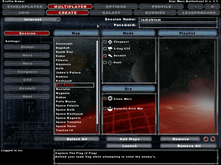
I played Star Wars Battlefront 2 in 2005 and came across a very ugly user interface feature. As much as I love the game, I hated the multiplayer creation screen because of one thing: the password field.
If you are making a multiplayer game, there are chance you’ll design a password field for private game. If this one work in appareance like a basic text field, but you have in really much more work to do if you want to make it (almost) perfect for your players.
Users who try to log in, create a new password or reset their password will be eternally grateful.
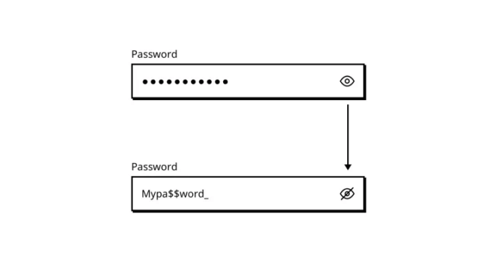
Show the input
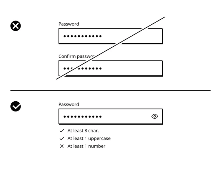
The first thing to do is to give your players the opportunity to check what they have just typed into the password field. This function is often represented by an “eye” icon to the right of the field.
When the letters are hidden, users can click on this icon and the visibility of the field changes from one state to another.
It’s simple, basic, as my favorite singer would say but it’s not always done.
Indicate whether the caps lock key is enabled
If you’re a PC gamer, you know it can happen: a missed click. And that missed click can lead to the Caps Lock key being forgotten.
Tell your users if the ‘Caps Lock’ key is activated when they type their password, and you’ll be giving them a helping hand and saving them time, believe me.
Also, there’s no need to display the text ‘Caps Lock is Off’, as this is the default state and won’t help that much.If you restrict your players to certain conditions when creating a password, you need to show them what happens when they try to type in the password.

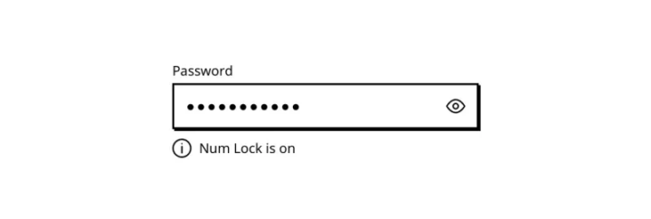
Indicate whether the num lock key is enabled
The same design tips can be applied with the Num Lock key.
Display the conditions required
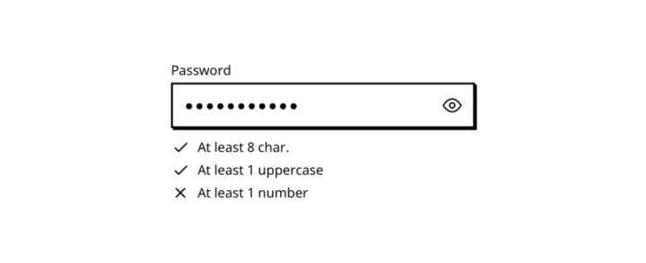
If you restrict your players to certain conditions when creating a password, you need to show them what happens when they try to type in the password.
Remember… It was 6 months ago, to create his password you asked your user to add:
- At least 1 uppercase
- At least 1 number
- At least 8 character
- And the last 3 digits of his credit card (Wait, what? Did you really ask that?)
A security measure, a fashion effect, a copy cat because your favorite game was doing the same or a useless waste of time? It doesn’t matter, you did it.
And today, he no longer remembers the constraints you imposed on him. So if they make an error, make life easier for them and remind them. Remind them of the conditions they had to meet days, weeks, months or years ago. And not just when they make a mistake.
Limit the number of conditions
If you’re using the previous method to make your password more secure, limit the number of conditions. The more you’ll have, the hardest it will be to remember the password.
Remind, the password issue I’m writing about here are not new, since there are password they exist. I don’t have the pretension to fix it, I just try to make the experience of video games players easier. As said by Sarah Robinson, Lead UI Designer at Behaviour Interactive:
The most important thing to understand about UI/UX is that the better we do our job, the less people will notice!
Delete the password confirmation field
If you follow the above steps, especially the one that allows the user to see what he’s typing, the password confirmation field, which was a security feature (a long time ago in a galaxy far, far away) to prevent mistakes, becomes obsolete. It’s bad enough typing the password once, don’t do it twice.
Fill the pseudo/email on the forgot password page
The process when your user realizes he have forgotten their password often looks like this:
- Comes to the login page
- Types in his credentials
- Receives an error message
- Realizes that he does not remember his login information
- Clicks on the link « Forgot your password »
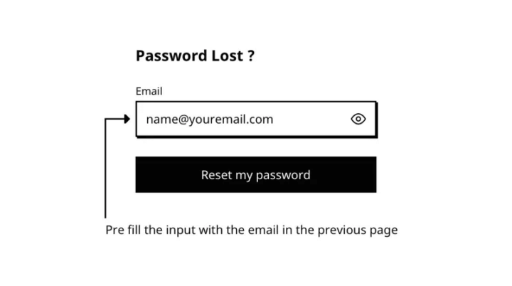
And that’s where the magic happens, because at this point in the user’s journey, you already know their email address or pseudo in game. Yep. They just typed it in a few seconds ago, in the previous page. All you need do to is to fill it on the present page so that they don’t have to write the same things over and over again.
Give visual feedback
The worst thing about the Star Wars Battlefront password field is that there’s no hover state or active state! I don’t know what I’m focusing on or where I’m typing or anything. A good interface gives visual feedback, your password field should too.
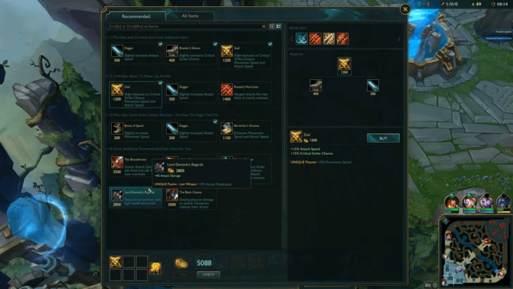
I remember when I used to play LOL, from the website to the games, they always had nice UI animations and visual states.
TLDR
Here is the UI design tips to make the life of your user easier on your login and password lost pages. Remember, less friction is more conversion. You don’t want to spend time fighting with bad interface, neither does your user.
- Show the input
- Indicate whether the caps lock key is enabled
- Indicate whether the num lock key is enabled
- Display the conditions required
- Limit the number of conditions
- Delete the password confirmation field
- Fill the pseudo/email on the forgot password page
- Give visual feedback
Links worth visiting
- Game Maker is free! – GameMaker is growing, celebrate with more free options this thanksgiving
- The Roguelike – High quality pixel art with unique artstyle and palette
- UI inspiration – from Twitter
- What Mario teach us? – even is something is essentially the same, psychologically it can be completly different
- Mistward – the last game from the amazing collective Sockpop
- More date are coming – for the Stardew valley concert I was talking about in the previous newsletter
- We’ve been busy – trying to participating to Indie Game Lyon show, I will keep you updated
- Soulash 2 – sandbox RPG roguelike with a procedurally generated open world, is coming soon
You have an interesting link about video games? Let me know!