#9 – Creating an intuitive in-game menu
The in-game menu is the player’s gateway into the gaming experience, making it crucial for UI designers (like you and me) to create an intuitive and user-friendly interface.
This tutorial will explore best practices for designing a menu that enhances the overall player experience.
Understanding player expectations
Players who press the ‘menu’ button in a game have certain expectations regarding content and structure. By searching the internet, here’s a list of recurring elements I’ve come across in menus:
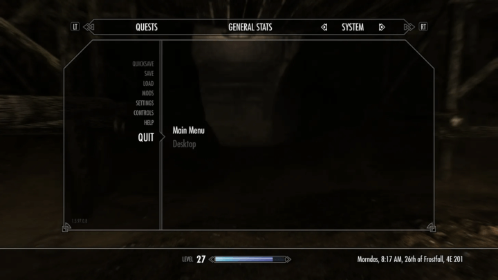
- Settings
- Save / Load
- Achievement
- Help
- Credit
- Exit
What’s more, opening the menu is also the easiest way to pause the game (no mum, it still doesn’t work online).
These are two well etablished convention, even if some video games don’t pause in order to reinforce the atmosphere (like horror genre) or just because they can’t (as said above). Deviating from these conventions can generate frustration and worsen the player experience.
Menu navigation and flow
The menu is a part of your creation players will see a lot more than you can expect. But not because they like it. Because they have to. And that’s the whole point.
Imagine the viewers of a streamer asking to lower the volume, you don’t want to make him lose is mind searching for it? He should browse the menu to find where you put this option.That’s why it’s important to design clear navigation paths in the menu, and here are some tips on how to do that.
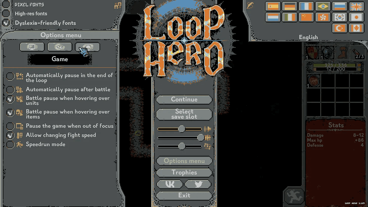
Group similar items
Group related menu items together to create a clear structure and reduce the time it takes to scan elements. Try to get to fewer than 6 or 7 items even if the right number of items in your menu depends on a few things, like the type or complexity of your game.
Example: In the main menu, group options like “Settings,” “Controls,” and “Audio” under a single category called “Options” for easy navigation.
Prioritizing important actions
Highlight frequently used or critical actions for immediate access. You have to choose which will be displayed and which will be hide in a sub-category.
If you don’t know how to choose, the best solution is to let players decide for you. How? In your game demo, track clicks for each element and analyse the most frequently used.
Example: Place “Continue” or “Resume” prominently at the top. The same way you’ll put “Exit” at the bottom. 100% of gamers want to exit your menu, this is a critical action.
Use of icons and visual cues
Enhance visual recognition with icons representing different categories. Not sure which icon is the best? Google: “settings icons”, go to images, there’s certainly one that’s going to come back more than the others, choose this one.
Example: Include a gear icon for settings, a controller icon for controls (captain obvious), and a speaker icon for audio, making it easier for players to associate icons with specific actions.
Consistent iconography and terminology
Maintain consistency in the use of icons and terminology throughout the menu.
Example: If you use a wrench icon for settings, continue using it consistently across all settings-related options. Also, keep using the same size and style for icon with the same level of hierarchy.
Progressive disclosure
Gradually reveal more advanced or less commonly used options to avoid overwhelming the player initially. You can also offer your players “recommended” settings by default, based on the most commonly used.
Example: In an options menu, have a “Basic Settings” section visible by default, with an option to expand into “Advanced Settings” for more customization.
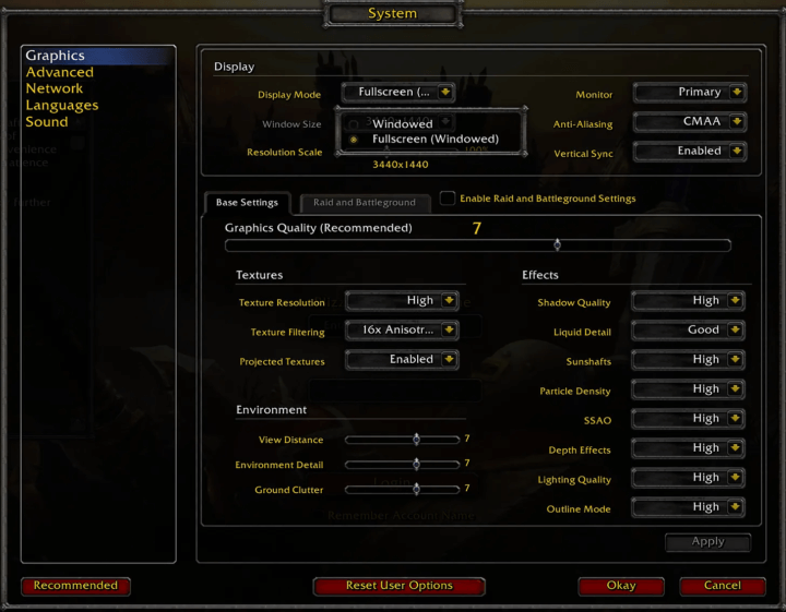
Consistency across platforms
If your game is designed to be played on several platforms (PC, console, mobile), you need to ensure that it is consistent from one to another.
You’ll have to face variable screen sizes and resolutions, diverse input devices, touch-Based Input, variable device orientations and so on…
Depending where your game is played, look at the best practices and follow them:
Feedback and responsiveness
Use animation to reinforces the visual feedback and provides a response to players actions. In the previous tutorial I’ve used some design animation to show you how I do it. With an immediate feedback you’ll assures your players that their input has been registered and make them feel in control of the interface.
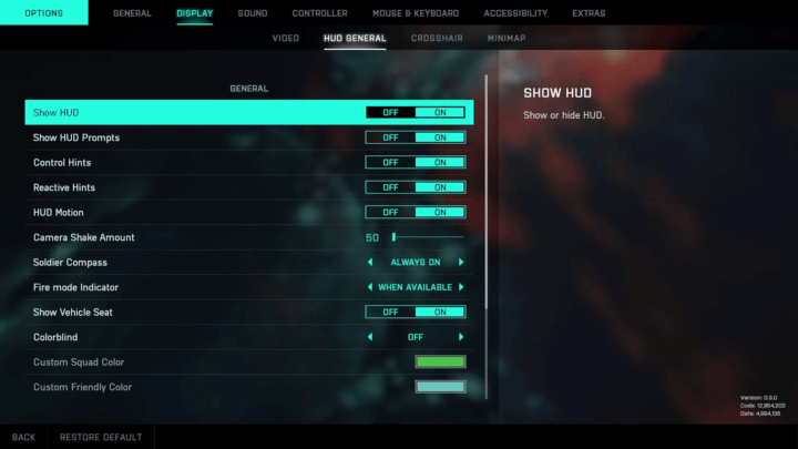
Search or filter functionality (for large menus)
Big hit can have tons of options, help players fasten their workflow by creating a way to search for a specific setting. Looking at this screen from Battlefield 2042, I guess how it might help.
Testing and iteration
No matter how many times I write it, there it is again: playtesting with real players is an essential aspect of UI/UX design.
The user will help you to improve the visual style, the content, the sound design, the emotional impact… do it as soon as you can!
Conclusion
It’s easier to design a beautiful interface than a usable one, which is why I’m giving you these tips. I encourage you to continually refine and improve your interface, based on trends, personal preferences and player feedback.
The last word: don’t forget your game’s identity. Take a look at this original menu from Unrailed, they’ve chosen to make it work like any other part of the game, and it works so well!
Links worth visiting
- Pixel art environments – every fan of the old pixel art pokémon should click
- A Novel Approach to Calculating Global Illumination – if you love maths and stuff
- Poisson Disk Sampling – what is Poisson Disk Sampling and why should you care?
- The Game Awards – where the “best independent game” nomination is fucked up
- Beautiful pixel art – if you want to support the artist follow this link
- Crafting a Better Shader for Pixel Art Upscaling – maybe the best video I’ve seen this month, what a quality!
- Original songs – composed by Steven Wahl a young composer
- Retronator – daily pixel art and gaming news
- Pixel joint – the internet pixel art gallery
You have an interesting link about video games? Let me know!