#11 – What’s behind the interface of Lethal Company
Let’s discuss the UI of a video game that has recently captivated me: Lethal Company. If you haven’t heard of it, this one dev made game have approx. 6 millions copies sold while I’m writing to you, and it’s truly a masterpiece. The game defined itself like this “A co-op horror about scavenging at abandoned moons to sell scrap to the Company.“ and that all you need to know to deep dive into this article. Enjoy!
What makes the UI of Lethal Company good?
After playing for 10 hours to the game, three aspects come to mind to answer this question:
- It perfectly match the genre and ambiant of the game itself
- It display the right amount of information
- It’s easily understandable
Let me elaborate on how these three elements are executed flawlessly.
It match the genre and ambiant of the game
First, choose your colors carrefully
It might seem trivial at first, but the initial impression a player gets from a game can significantly impact their experience. Picture yourself as a valiant knight adorned in heavy plate armor, only to be greeted by a user interface straight out of a science fiction film—it’s bound to be a tad confusing, isn’t it?
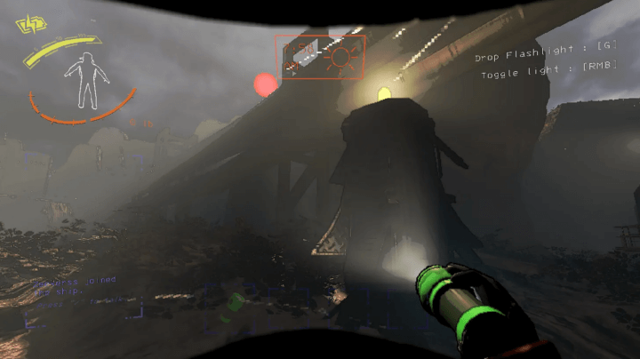
In Lethal Company you’re travelling in a spaceship from abandoned moons to abandoned moons in order to find scrap to sell. Meaning that the game take place in a (not that) bright futur.
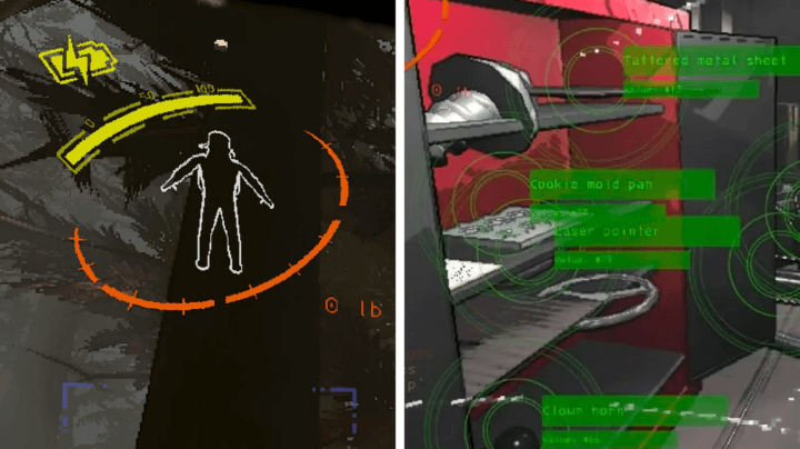
If we scour internet for sci-fi movies, in the collective imaginary color are flashy without gradient, from blue & green for diverse screen informations, to red or orange for scary alert message (those who often appear when the ship is going to crash).
And it’s precisely this type of color scheme that permeates throughout the UI of Lethal Company.
Then, use shapes and ornament
Shape and ornamentation are crucial considerations when aligning the interface with the game’s ambiance. Sure, your interface could be packed with icons in bordered squares, and it might work, but what emotional resonance does it convey? Likely, it imparts the impression of an unfinished game.
Instead, consider incorporating pillars to frame your interface, utilizing colors reminiscent of the travertine used in ancient Rome’s construction, and adding foliage to liven things up. By doing so, you’ll craft an interface that harmonizes seamlessly with the essence of your game.
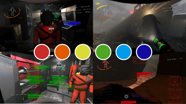
Now look at this colorful interface from Alba: A Wildlife Adventure. I’m French, I live near the Mediterranean Sea and when I see this map I just feel like it’s summer. Instead of opting for a standard full-screen map, the developers decided to incorporate a tangible element—a genuine card crafted from paper, adorned with a radiant blue hue and a contemporary font.
Returning to our primary focus, let’s examine the interface of Lethal Company. The developer has opted for straightforward shapes such as circles and squares, alongside a modern font akin to what you might encounter in a code editor. Additionally, transparency has been integrated into elements, evoking a sense of holographic or screen-projected components.
In contrast to interfaces designed for games set in the past, those depicting futuristic settings tend to lean towards minimalism, and this is also the case here.
Display the right amount of information
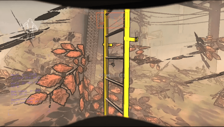
Now, onto the second point of this newsletter: it’s crucial not to inundate the player with excessive information. Remember, at its core, Lethal Company is a horror game. To ensure that players remain immersed and maintain a heightened level of stress, it’s imperative to keep the interface as unobtrusive as possible. While the size and color of interface elements are vital in reducing their visibility, it’s equally important to discern when to display specific information.
If you have played the game you know that it’s a relativly easy one to understand. Your character’s actions are limited to simple maneuvers like walking, jumping, carrying, and activating objects. This simplicity is effectively mirrored in the UI design.
The most important thing to understand about UI/UX is that the better we do our job, the less people will notice!
Sarah Robinson, Lead UI Designer at Behaviour Interactive
A ladder right in front of you? What better moment to reveal the button prompt for climbing to its very top. While it may seem straightforward, mastering the timing of displaying pertinent information is paramount.
Make it easily understandable
Of course, you don’t want your interface to be difficult to understand. And while we’ve touched on this aspect before, let me say it again: utilize common icons and patterns.
Have you seen how the torch battery is represented? Yes, by a battery with a lightning bolt on top, all in yellow like the colour of electricity. It doesn’t get much more cliché than that, does it? Unlike the rounded orange bar that indicates how much sprinting time the character has left, well, I didn’t hear anyone ask what this yellow resource was for – surprisingly, everyone instantly understood its purpose.
Introducing a new resource often poses the challenge of ensuring players understand its function. While Lethal Company opts for familiar elements, let’s consider another scenario—when a game invents a currency, for example. Yes, I’m referring to Pokémon.
Invent based on what already exists
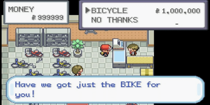
If you’ve ever played the original Pokémon games, you might recall that a bicycle costs a staggering 1,000,000… pokedollars? Indeed, this currency exists solely within the fantastical world crafted by our Japanese friends. To facilitate the understanding of this new resource, you’ll notice that the symbol utilized is a “P” with two bars at the end of its vertical stroke. This pattern bears a striking resemblance to real-world currencies such as the Dollar, Euro, and Yen.
By leveraging established conventions, you not only streamline your own processes but also minimize the learning curve for your players.
TLDR
From shapes, colors, ornaments to patterns, the user interface of Lethal Company seamlessly complements the game’s genre and ambiance. It strikes a balance between ease of understanding and unobtrusiveness, allowing players to remain immersed in the atmospheric horror experience.
If you haven’t already, I highly recommend grabbing a friend and diving into this game. Lethal Company’s appeal extends far beyond its UI—it’s an unforgettable experience that demands to be played.
About my game
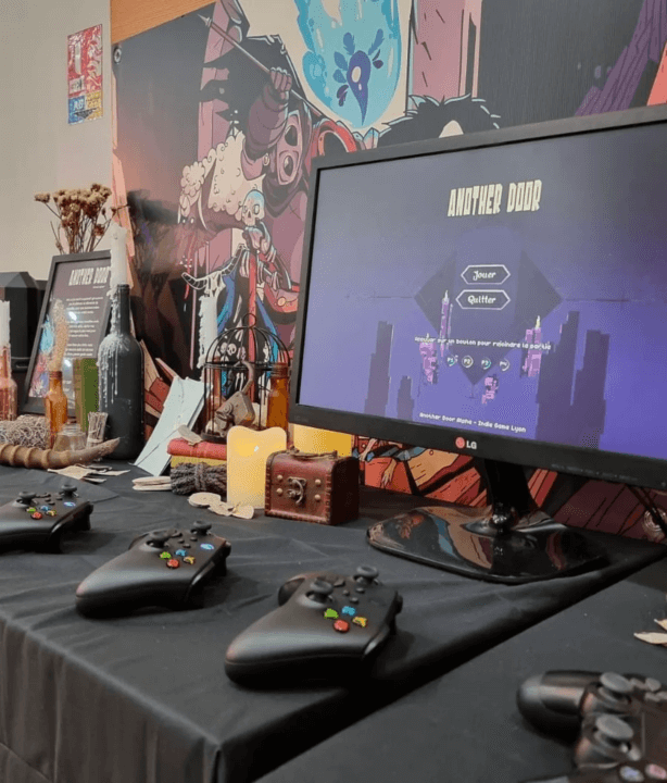
We’ve been busy making the very first demo version of our game Another Door for the Indie Game Lyon a showcase in France.
Everything went smoothly; we had over 75 players testing the game while also connecting with numerous other game developers, artists, sound designers, and publishers. We’re thrilled with the reception—it was evident that people truly enjoyed the betrayal concept of the game. This positive feedback has only bolstered our motivation for what lies ahead.
Links worth visiting
- The complete guide to creating Visual Effect within League of Legends
- A quick pixel art tutorial introduction
- From putting a prototype on itch to over 30.000 copies sold in the first month after Steam release
- What happen when you mix holographic stuff with pixel art card
- Meet Celestialmaze an artist making node based animation
- Face the supernatural dangers of the Olympic Exclusion Zone with a car as your only lifeline in this driving survival adventure!
- GMPulse is a GameMaker extension that makes it possible to manipulate information about your game while it’s running.
- Glaze is a system designed to protect human artists by disrupting style mimicry.
You have an interesting link about video games? Let me know!