#1 – How to make our game colors accessible to everyone
In this article, we’ll take a look at how to make our colors easier to understand. Lack of accessibility is a hindrance to reading the game and, in the end, it’s the user who pays the price.
It is estimated that around 8% of boys have some form of color blindness, while the figure is less than 1% for girls. This means that approximately one boy in 12 and one girl in 200 are affected by this color vision disorder.
If you don’t want to degrade the gaming experience for these players, you’ve come to the right place.
Are you starting from scratch and don’t know where to find your colors? I recommend Lospec, a site where other artists offer their palettes.
At the beginning, a definition of accessibility
Let’s take a look at the definition of “accessibility” given on the French government’s design website:
Digital accessibility means making digital content and services understandable and usable for people with disabilities.
However, we should point out that accessibility is not limited to people with disabilities.
Many factors other than our retina can affect the legibility of our interfaces, such as a poorly calibrated screen, a pair of glasses with tinted lenses or the sun’s rays falling on our monitor.
Check the contrast between text and background colors
Contrast, in accessibility, refers to the difference in brightness or color between elements to make content more readable and understandable.
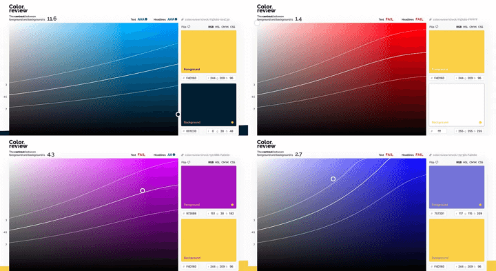
Let’s say we have a beautiful yellow #F4D160. How do we know which colors to use to write on top of it? Or conversely, can I use my yellow text to write on a gray, white, black, blue or purple background?
Color Review is one of the best sites for working on this subject. It allows us to confirm that the contrast between my background color and my text color (foreground) is valid according to WCGA (Web Content Accessibility Guideline) standards.
All that remains is to test each of the color combinations we wish to use, and let the tool indicate whether or not the ratio is sufficient.
- Yellow on black #001C30? Yes.
- Yellow on white #FFFFFF? That’s no.
- Write purple #9726B6 on yellow? Titles yes, smaller texts no.
- Write blue #7573D1 on yellow? That’s a no.
Improving legibility for people with color blindness
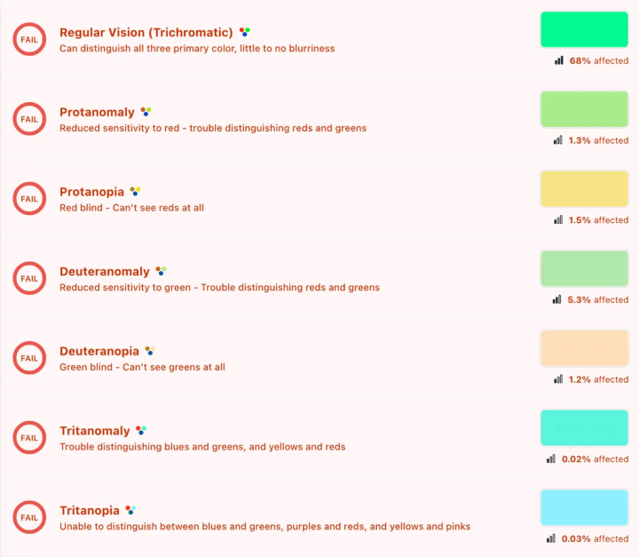
The second point that interests us when we talk about accessibility is Daltonism, the famous visual anomaly that affects color perception, and which affects around 8% of boys and 1% of girls.
Of course, it’s unthinkable that we should leave these people out in the cold, so let’s do all we can to make their gaming experience as pleasant as possible.
Modify your color palette
One solution is to adapt our color palette so that all users can approach it correctly. To this end, there are websites and applications that simulate certain types of vision. This makes it much easier to see how colors are perceived by other people, and to correct (or not) accordingly.
Create a specific palette
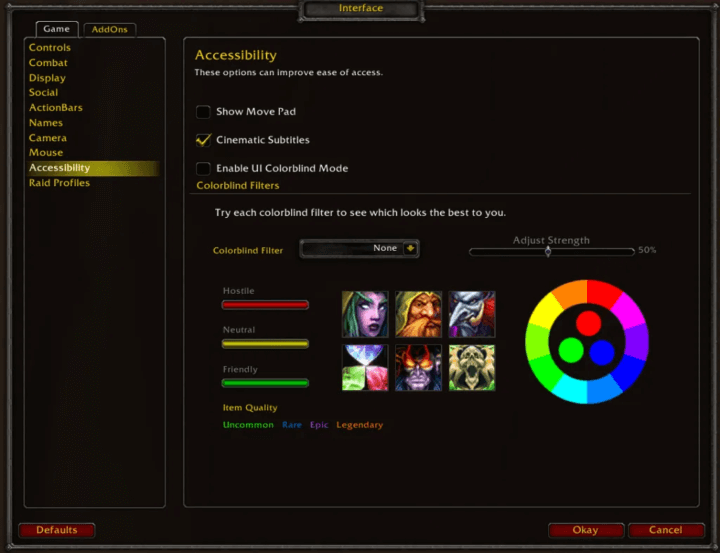
A second solution is to create a color-blind mode in the game options. Can’t agree on the colors to provide to all your players? Let’s create a specific palette for color-blind people.
Several games offer this option, including World Of Warcraft :
Color, yes, but not only
What we need to understand here is that, despite our best efforts, there’s always a risk that the player won’t see what we’re trying to show him if we rely solely on color.
For example, if you open the Wikipedia page dedicated to the subject of color blindness, you can read that achromatopsia is a disease that manifests itself by a total absence of color vision. In this case, even perfect contrast and a suitable palette may not be enough.
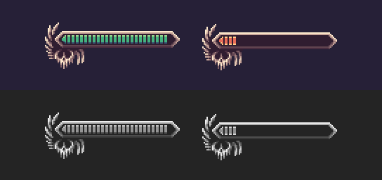
Let’s imagine for a moment that we want to represent a state where the life bar has reached a critical stage. Instinctively, the first idea would be to change the color of the gauge from green to red. Here’s the vision of someone suffering from this rare case of color blindness:
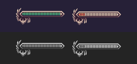
It’s immediately more complicated, if not impossible, to understand the information, because it’s based solely on the use of colors.
One of the easiest ways to correct this problem is to play with another element. We can, for example, choose to remove the life bars as they diminish, in addition to changing the color. The result is instantly more digestible and readable:
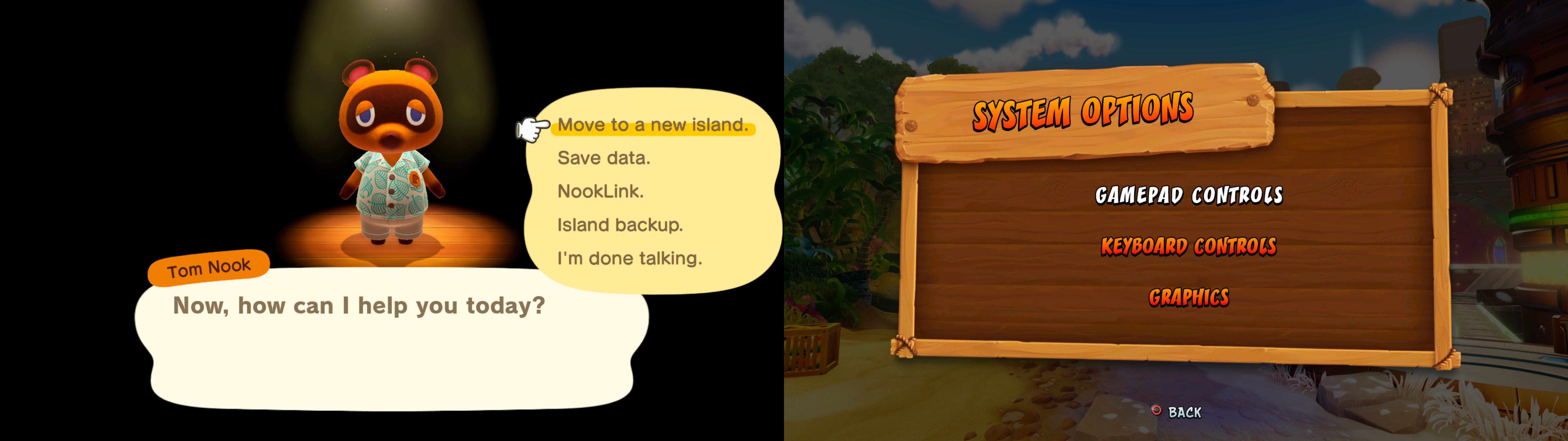
Game menus as a battle horse
Although it may seem trivial, this is a recurring error in many video game menus.
To compensate for this, some designers choose to add extra elements to differentiate items from one another: an outline, an arrow, a line…
The Animal Crossing menu, for example, features a cursor in addition to yellow highlighting (left), while Crash Bandicoot’s selection is indicated only by a color change:
Finally, a few recurring phrases
Here are a few phrases that come up (too) often when we talk about accessibility, and my response to them.
Accessibility takes too long to set up, I’ll do that later.
Yes, making your game accessible is an extra workload. Nevertheless, putting the right practices in place at the outset saves time later on.
Accessibility is a constraint, it limits my creativity
Yes, accessibility is a constraint. But what about the poor gameplay experience you’ll create for your players? It’s worst.
Game Jam is the very essence of the word “compulsion”, and yet thousands of games, each more extraordinary than the last, are created every year.
If I understand my interface, then the others too
Apart from the fact that over-inflated self-confidence is rarely a good thing, it’s rare for a design element to be perfect.
That’s where user reviews come in. Having the ability to capture user feedback, learning to ask the right questions, or knowing how to analyze usage data are just some of the many skills of a good UX Designer.
Don’t just rely on your own opinion, learn from others and, above all, ask your players for their opinion.
Want to learn more?
I strongly invite you to explore this vast subject, in particular via these links:
- Web Content Accessibility Guideline
- Uxplanet – Here’s What You Need to Know About Color Accessibility in Product Design
Links of the moment
- Dome Keeper – or the art of using a limited palette to make a beautiful game
- Our game – part co-op, part turn-based, we only use 32 colors
- Mini-jam – feel like getting into video games, but have no idea how to go about it? Start here!
- Game Maker Studio resources – chart your course through the world of Game Maker Studio
- Some brush ideas – for your future pixel art landscapes
- Pixel art inspiration – minimalist, with few colors, to keep with the newsletter theme
- Tip of the moment – from (rip) Twitter
- The interface of the moment – because if you haven’t figured it out yet, we like it here!
Do you have a link that talks about video games, interfaces, game dev or design? Let me know.