#7 – How to keep your interface consistent
By ensuring consistency in the placement and appearance of UI elements, combined with UX best practices, we will establish a predictable and familiar user experience. This will enable us to create a better experience for our players, by reducing cognitive load and improving accessibility.
It can also save us a huge amount of time during design and development, by encouraging us to reuse colors, spacing and typography.
Take a seat, grab your favorite drink (coffee latte addict in the room, raise your hand), and learn something new about design in video games today.
Enjoy!
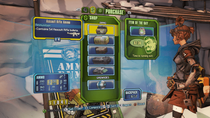
What is consistency in design?
Consistency in design is about making elements uniform, having them look and behave the same way.
Uxplanet
As human beings, we have the cognitive ability to identify similar elements, and I believe this is where the Law of Similarity comes from. We’re also curious by nature: from chilhood to death, we’ll always be learning new things.
And that’s the whole point of these capabilities: when players are confronted with a design they already know, they are more likely to understand how to interact with it, which means increased engagement and satisfaction.
What does a consistent design look like?
Take a look at the UI design of the game Unpacking, a zen-like puzzle game about the familiar experience of taking items out of boxes and setting them up in a new home.
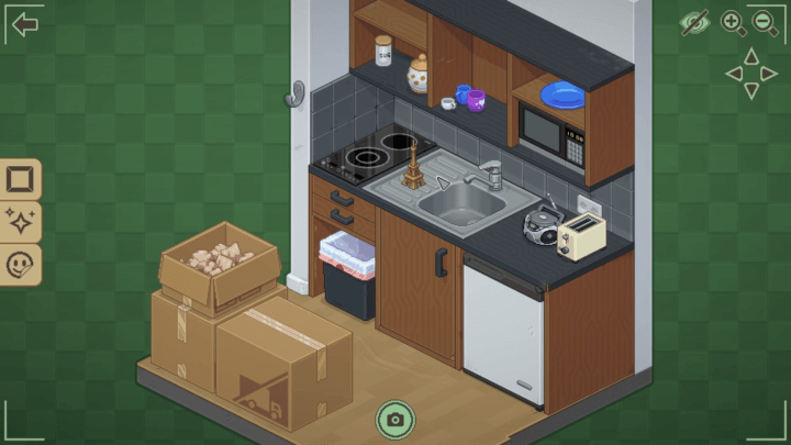
At first glance, we can see design consistency. Yes, but based on what?
- Style, everything is in pixel art, with same pixel ratio.
- Colors, the palette is always the same.
- Buttons, they have the same shape, icon style and size.
- Icons, they use the same black and filled style.
- …
These elements are part of a whole, and many others can be taken into account, such as story, gameplay, control, dialogue or even sound design. But this is a consistency that is more a matter of “game” than “design”.
The benefits of design consistency for the player
Chances are your users have already played a game in their lives, which means they’re already familiar with the basic screens of almost every game: title, guided settings, tutorial, cutscene, paused game, character selection, map and so on… you get the idea.
This is where design consistency is important, as we’ll be using it to reduce the learning curve for our own interface.
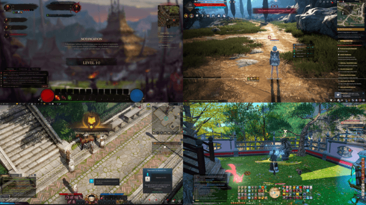
Have you ever played an MMORPG? I won’t mention World of Warcraft in this article (oups, I have), but take a look at these MMOs. You already know where the UI elements should be placed: chat at bottom left, spells in the middle, mini-map at top right, life at top left, quest at right… It’s a very small learning curve, isn’t it?
Respect industry standards and practices
Launch a random game from your steam account (I can’t believe you don’t have one), and press the “start” button or the “escape” key. Does this open the menu with a “quit” option? Of course it does. It’s a question of consistency between game standards and customer habits.
This sentence may not have been true twenty or thirty years ago, when video games were not very standardized because the medium was young (which is perfectly normal, everything starts somewhere).
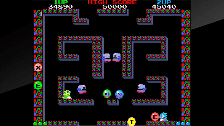
Older game interfaces behave in the same way
Moreover, if you look at the game Buble Boble released in 1986 (holy chilhood memories) and compare it with other games released at the same time, you’ll see that they all display parameters such as life, high score and time at the top of the screen. This was the norm at the time.
Reusing well-know industry habits is the first step in minimizing the cognitive load and using the knowledge acquired by our players.
Study UI consistency
Now that we know why we need to keep our design consistent, let’s take a closer look at how other game designers do it.
Colors matter
The first example concerns the game Disc Room, a game about, hum… discs in a room. Look at how they simply made the design with the same red, yellow and white in the map screen.
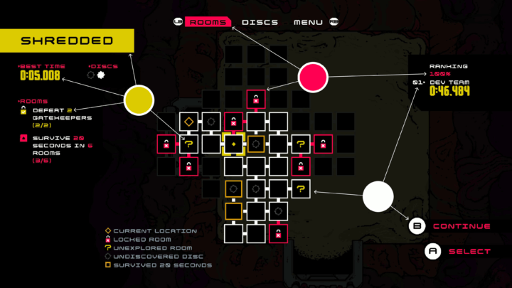
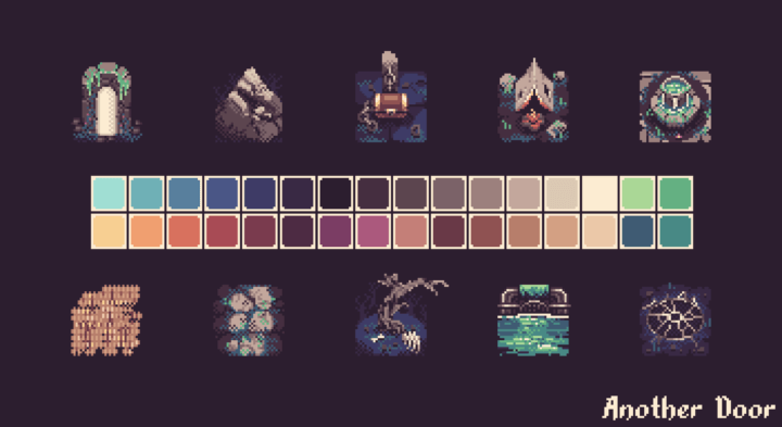
If you’re working on a small game, my best advice is: pick a color palette and stick to it! It’s a great way to force creativity, make coding with color variables easier and keep the design consistent.
For example, for my game “Another Door”, I chose a palette of X colors, and here’s the result:
Filter and style too
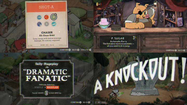
Here are 4 different screenshots of the same game: CupHead.
Color aside, the design is consistent, thanks to the filters and style Studio MDHR used to design it. I Inspired by 1930s cartoons, the visuals are completely unique. Sticking to one style doesn’t mean staying classic.
Finding the right balance between keeping the design consistent and innovation-based change is key to hitting the right UX experience notes. The “secret” lies in understanding your users’ needs and reflecting them in your design decisions only when necessary. Small changes will help with the product evolution while keeping design consistency intact.
Radiant
Other design properties are also important
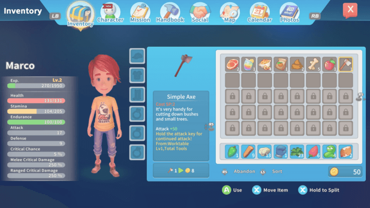
Text shadow, border radius, margin, padding, font size, border width, gradient, fill or border, inner shadow… are elements that all have their importance.
A good way of preserving the consistency of a design is to define rules and reuse them throughout the game. In the code, they will take the form of well-defined global variables that all user interface elements will use.
Look at that inventory in My Time At Portia: the designer has done a good job of repeating the spacing, radius and size of the elements.
Conclusion
Players aren’t lazy, they want to be efficient, and you can help them. Reuse design patterns that have proven successful with your users. The challenge is to find the right balance between innovation and consistency.
Links worth visiting
- Game dev story – how my 1-year passion project with 0$ budget grossed 200 000$ and opened the door to full-time indie dev
- Color tutorial – from @theartistjulian
- I’m a bluesky now – game dev friend, say hi
- Stardew Valley: Festival of Seasons – is an intimate, immersive live concert featuring fresh arrangements of the most cherished songs from the game’s mesmerizing soundtrack
- New look for PS5 console – Smaller PS5 design comes with 1TB storage for PS5
- Summerhouse – is a tiny, atmospheric building toy
- An introduction to shader art coding – explore the fascinating realm of shader
- Roboquest – is a Roguelite fast-FPS that can be played alone or by two players in co-op. This game was made by some old friends of mine, so you should definitely check it out.
- Training AI to Play Pokemon – with Reinforcement Learning
You want to share a link about video games, interfaces, game dev or design? Let me know.