#8 – Better-designed buttons
Have you ever spent time going through the various screens of your own game’s user interface, thinking that something was wrong? This can be due to many things, and one of them could be your buttons. Are they pretty enough? Are they designed with all the states they need? If you’re not sure of the answer, dive into this article and learn how to make your buttons stand out.
This article will be more tutorial-oriented than the previous one. I’ll show you how to make buttons stand out through design and I’ll focus on a style I really like: pixel art design.
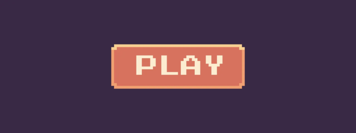
Make a simple shape
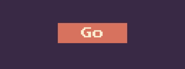
Let’s start by shaping the button, which will be a 48px by 16px colored rectangle with a simple “Go” label:
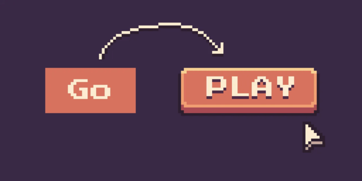
Across our interfaces, buttons don’t have the same importance. There’s often one main button, and it’s recommended to have only one at a time. One screen, one main action. It must have a stronger visual appeal than the secondary and tertiary buttons that can be found on the screen.
Look at how, with the same text and the same color, we can make the buttons have a different reading order:
Add a clear label
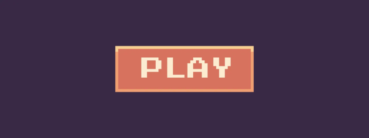
Imagine your game’s menu screen, where the main action is to launch the game, and the button simply says “Go”. Good button wording invites users to take action, which they do by using task-specific words and verbs. Instead of confusing formulations, we can use clear wording like “Play”.
Also, consistency works for wording too. If you use verbs and simple words in your buttons, keep them in your game interface.
Let’s add this to our button:

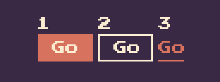
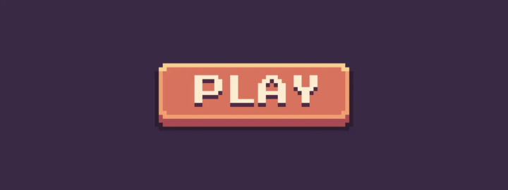
Borders to help users stay focused
To make it more attractive, we’ll add a border. They reinforce the feel of a traditional button and create an eye-catching target for the user. You know, UI buttons are inspired by real buttons – those on radios, switches or airplanes… That’s why they have borders, shadows and also states, which we’re going to draw below.
Without a border, the UI element looks more like a link than a button, and the distinction between buttons and links is an important one:
- Links are used when you’re navigating to another place, such as a ranking page
- Buttons are used when you perform an action, such as: “play” “delete“ “save”, etc…
That’s why, if you have a choice, it’s safer to use a visible border.
Border radius to make it more friendly
In design, psychology is almost everywhere. Even in border radius.
The use of curved edges in design can create a soft, friendly feel, enhancing the user’s comfort and relaxation.
Conversely, angular corners can give an impression of harshness and hostility, while rounded corners can make a design more approachable and welcoming.
This is why designers often use rounded corners in products aimed at families or children, to promote a friendly, welcoming aesthetic.
Depending on the category your game fits into, you should consider making it more user-friendly like Animal Crossing, or using a sharper form like Silent Hill.
Let’s add some border radius to our pixel art button to make it more friendly:
Shadows to add depth
Now, as we said before, buttons have a state and are inspired by the real world. Real buttons can be pushed; to reproduce this effect, we need to add shadows:
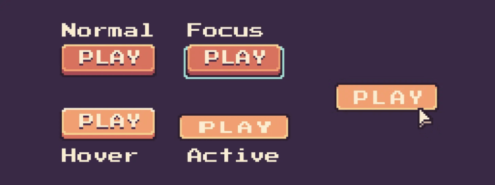
States to make them functionnal
Now that our buttons are looking better, let’s take a closer look at the 4 essential states that need to be conceived when working on UI design. Each state has its own purpose:
- Normal – indicates that the component is interactive and enabled
- Focus – indicates that the user has highlighted an element, using a keyboard or other input method
- Hover – indicates when the user has placed a cursor above an interactive element
- Active – indicates that the user has pressed the button
Here’s how we can design and animate (with the 12 principles of animations) each of the states to match:
What about the disabled state?
You may encounter the “Disabled” state, which I don’t recommend at all. It’s an easy solution that may seem good at first, but you have to understand that a disabled button doesn’t give your players any feedback.
“Don’t make the user think” is the most important usability rule. When you disable the CTA button, you make the user think about how to activate them. Instead of clicking a button and seeing a specific error message, users will scan the form up and down in order to find what keeps the CTA disabled. It is especially true for long, complex forms — imagine a situation when you fill out a long-form on mobile, and only a fraction of the form is visible in a viewport.
Nick Babich
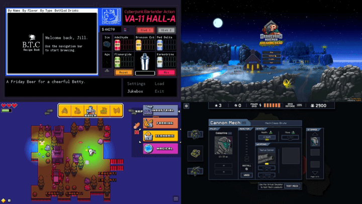
Example of pixel art buttons
This little tutorial is coming to an end. I’ve obviously designed a very simple button, but keep in mind that they’re part of your game and therefore part of your brand image. You can fully express your creativity with button design, while keeping accessibility in mind (color contrast, states, interactivity, size…).
Here are a few examples of what you can do with pixel art buttons:
Conclusion
To improve the appearance of your pixel art buttons, a few steps are required. The aim is not only to make them more beautiful, but also more functional.
Thank you for reading this short tutorial on user interface design in video games. It was a bit different from what I’ve done before, more focused on tutorials with little tricks, I hope you enjoyed it.
Links worth visiting
- Might of Merchants – Experience a unique and lovingly hand-drawn world in which you have to prove your skills as a merchant
- Mosa Lina – a hostile interpretation of the immersive sim, where nothing is planned, and everything works
- Gaijin Entertainment – open-sourced their War Thunder engine
- Cities Skylines 2 – The developer and publisher of Cities: Skylines 2 have admitted the game’s performance isn’t up to scratch
- Picosynth – is a playful way to create simple loops and beats
- Juice FX – allows you to easily create in a matter of minutes (usually even seconds) beautiful animations for your sprites
- What makes a good super move – They’re almost by definition the best moves that a game will give you, but they can’t be TOO good
You want to share a link about video games, interfaces, game dev or design? Let me know.