#6 – What’s the right size?
Taking a break from the magical lands you’ve been exploring since this morning, you retire in the first city at the merchant shop to sell your items. As you squint to try and read the information on the button, your brain switches to off mode and you do it automatically.
But by accident, you press the wrong button and sell this very rare item with no way of getting it back. It’s gone. Forever.
You know there are mistakes, but why on earth was this button so small? And why was the text so hard to read? Frustrating, isn’t it?
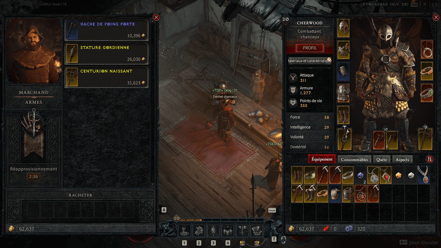
Let me be clear, there is no way of eliminating 100% of player errors. I mean, their controller could be lag jumping, they could have misunderstood the label or they’ve just been playing drunk, haven’t they? But fortunately, in our over-connected digital world, we have a standard that will help us prevent them. The first thing to do is to adapt the size of the UI elements.
From buttons to text, let’s look at the right size for UI design elements.
Size your buttons the right way
Let’s talk about the size of one of the most common element in video games, and I’m not talking about RPG element (well, I could actually), but buttons. Do you know of a single game without buttons? I don’t.
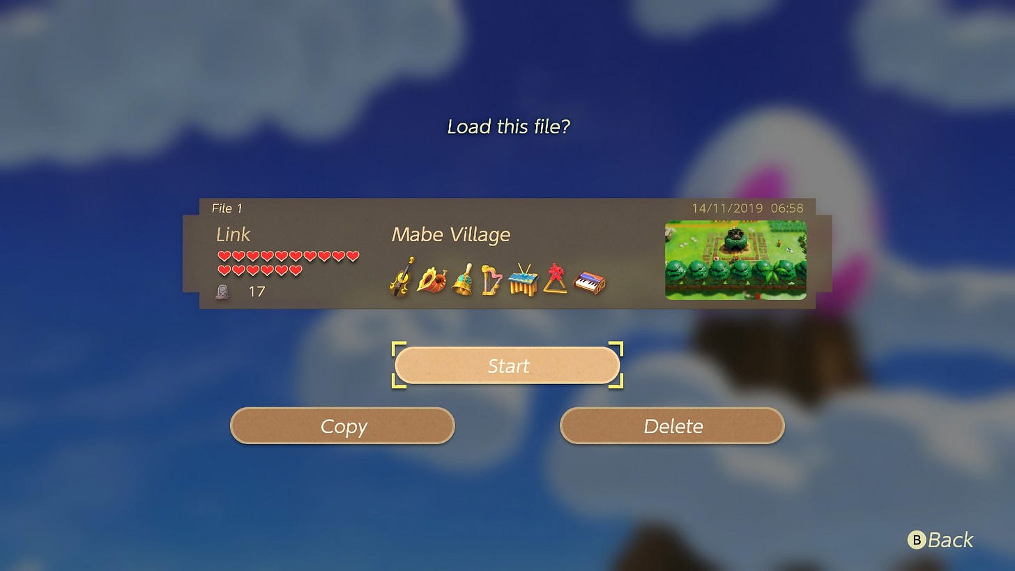
If you are working on a mobile game, there’s one famous (well, in the design world) study by the MIT Touch Lab that suggests 10mm × 10mm is the best minimum size for buttons because of the average size of fingertips.
For non-touch screen user, we’ll take two other studies, one from the WGCA (we talked about it in the first article about color accessibility ), and the other from Google, which state that 44px / 48px is a good size.
Take note: to produce a more accessible UI design, the first study indicates that if two buttons are placed next to each other, they should be separated by at least 8 px.
A rule that also works with the last article I wrote on modal design. For example, adding a padding between the button and the border of the modal prevents the modal from being closed by clicking outside.
An unconventional design style
I know that video game design tends to be less ‘conventional’ than website design, if you take the Persona user interface as an example.
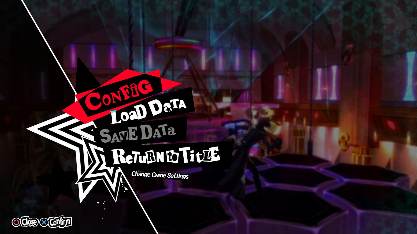
So should we be concerned about the rule below?
- Buttons are generally menu items that cannot be clicked with the cursor
- The height, width and size of the button/text are correct
- There is a visual state for the selected element (based solely on colour, please note)
- A missed click won’t frustrate the player, thanks to the action behind each button
Yes, this interface doesn’t respect all the rules I’ve described, but as always in design, decisions are based on the situation and user feedback.
Design tips
Organise a test session. With people you don’t know, not just family or friends. Players who will give you honest feedback because they don’t care about hurting your feelings. Don’t take it personally. Learn to accept them or reject them, but move on.
There are lots of different things you can track: stats after a win, most chosen character, favourite spells or even button clicks. It’s a way of getting feedback from users.
What about text size?
Let’s do a 3 in 1 and learn about the right size of text, paragraphs and line spacing. Because if the buttons are important, so is the text. I suppose it happened to you too, that moment when you became that meme.
It’s weird enough for players who don’t have eyesight problems, now imagine for those who do.
Rule of thumb
Rule of thumb: text should be at least 16px. As I said, it depends on the situation, if you’re playing away from a large TV screen in a multiplayer game, you should obviously increase this value.
I’ve seen many designers use a font size of 12 px, because “it looks better”. Yes, that may be the case. But, please, don’t. 12px text is reserved for dark pattern, like the text you want to hide as abusive terms of service.
As for the all-too-often-repeated argument that “if I can read it, it’s OK”, don’t forget that you are not your user. This is the False-Consensus Effect.
In psychology, the false consensus effect, also known as consensus bias, is a pervasive cognitive bias that causes people assume that their personal qualities, characteristics, beliefs, and actions are relatively widespread through the general population.
Wikipedia
Take care of your paragraph length
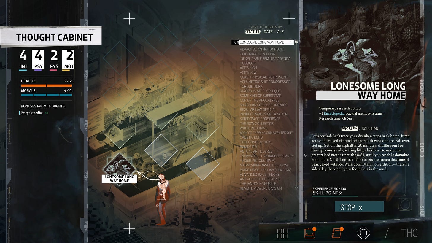
Let me give you a hint about paragraph size. The WGCA recommends that a line of text should not exceed 80 characters, between 50 to 75 characters, if we take this article for reference.
Take the first book in your library and count the number of letters on a line. I’ll bet it respects this rule. Look at this screen from Disco Elysium, a game full of text, where the designers have respected this rule.
Line spacing is also important
The third and final piece of advice on user interface design will be about line height or line spacing. This is the vertical distance between lines of text. For optimum legibility, we recommend multiplying the font size by at least 1.5.
With these three tips, the size of the paragraph and the height of the line, you have the right weapons to make the user interface pleasant for your players.
Let players use their favourite settings
An important point to mention is to give your users a choice. 10 players will have 10 different preferences, let them make their own choice, add an option in your configuration menu to change the font size.
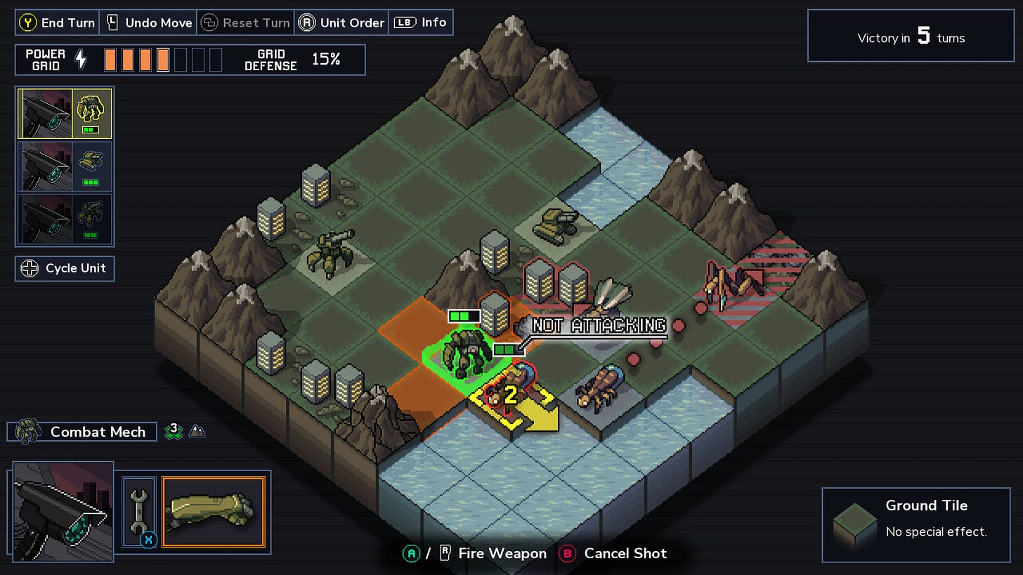
What should I do if the error persists?
I know it’s not easy to develop, but what better way to help the user than to undo their last action? Take inspiration from Into The Breach, a turn based game in pixel art.
Conclusion
Size matters. Bigger buttons and text are often appreciated. A good user interface in a game should be as accessible and easy to use as possible.
Don’t expect everyone to read like you, refer to studies, follow guidelines, keep an open mind about the situation and you’ll be fine.
Links worth visiting
- Pixel art inspiration – colorfull as I like it
- How To Make Sound Effects For Games – a video tutorial for indie game dev
- Automatically updates sprites – in your GameMaker Studio
- Picocad – is a program to build and texture lowpoly 3D models
- Do you know this game ? I would love to play it in co-op
- Game next door – where we talk about video games the way we’d like to be talked about
- ModdingMarius – Modding, Restoration and Repair of Retro Consoles
- PixelOver – is a software package that transforms your assets into pixel art
- Stardew Valley – 1.6 content sneak peek
- Islands & Trains – islands & Trains is a relaxing sandbox building game.
You want to share a link about video games, interfaces, game dev or design? Let me know.