#5 – Best practices for modals in video games
After a hard-fought battle, your player manages to defeat the boss, and immediately has a choice of several rewards. That’s the moment you choose to display it in a modal window, a design element that sits in front of an overlay, and monopolizes all the attention on the screen. But is it a good choice?
In this article, we’ll look at what a modal is, when to use it and what you can do to improve it.
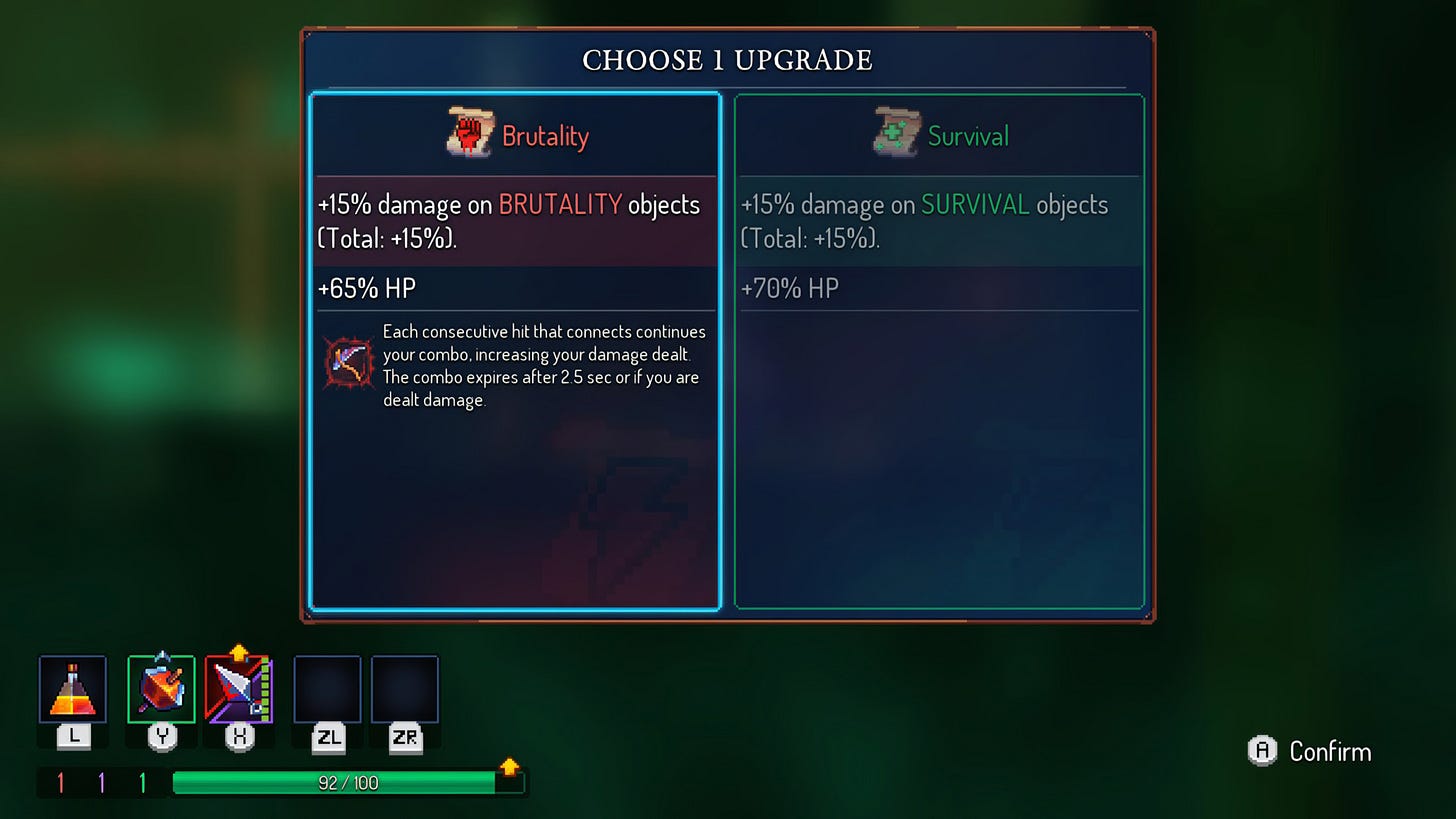
What is a modal?
As I like to do, let’s start by defining what is a modal in UI design:
A modal window creates a mode that disables user interaction with the main window but keeps it visible, with the modal window as a child window in front of it. Users must interact with the modal window before they can return to the parent window. This avoids interrupting the workflow on the main window.
Wikipedia
All too often used on the web to steal your email, they tend to streamline the player’s workflow by highlighting new elements while relegating the task in hand to the background.
When should a modal window be displayed?
I’ve tried to group use cases into categories, and have come up with four:
- Highlight essential informations, as in the case of an app tutorial, where we come across an impressive number of pop-up dialog boxes, leading us to get into the habit of instinctively selecting “Close,” “Cancel,” or “OK” without actually reading.
- Block the application’s progress until the necessary information, such as a password, is provided.
- Warning that the consequences of the current action cannot be undone. With regard to the first point, this can be considered ineffective, as the user gets used to it. Instead, it’s suggested to propose a reversible action with an “undo” option.
- Collect new settings: access to the application is temporarily restricted while adjustments are made, just like the game “The Ascent” did below.
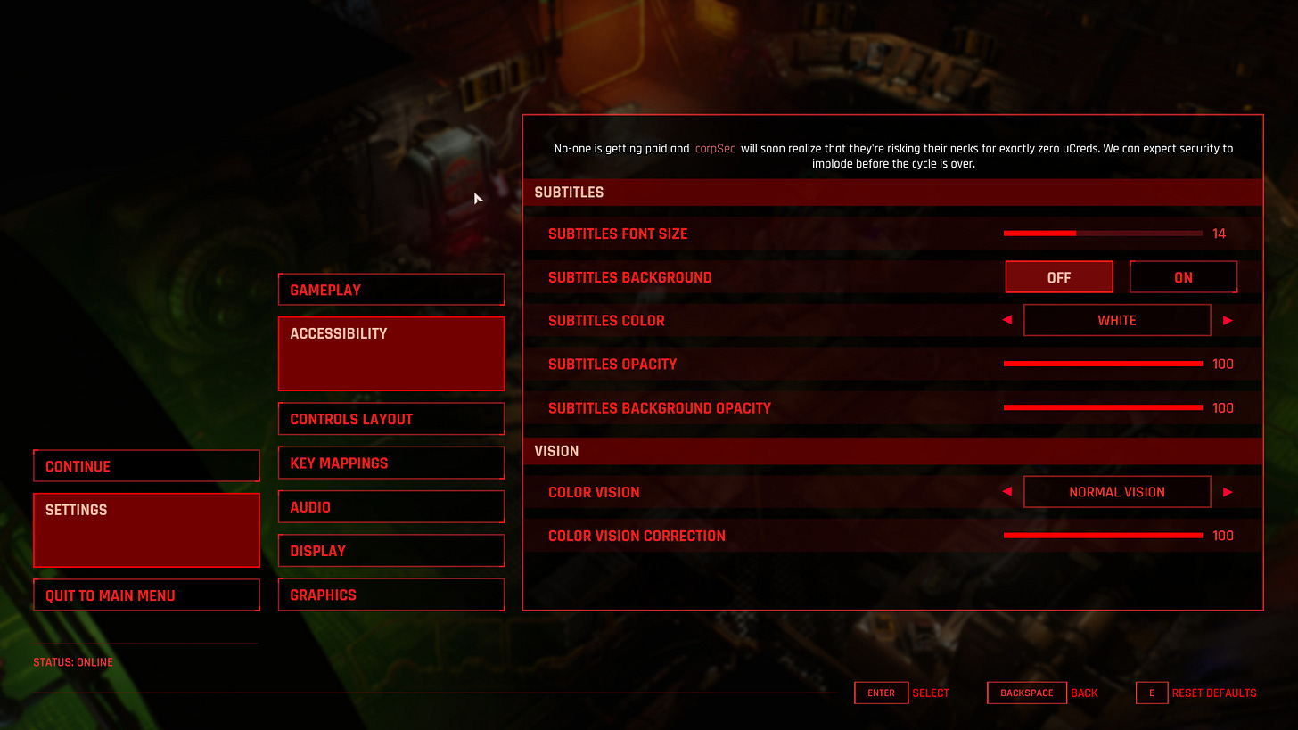
Did you know? Some game designers decide to leave the game running in the background while the modal windows are displayed. Ideal for horror games to create a stressful environment, forcing the player to be quick and careful where he takes his break.
Use modals very sparingly
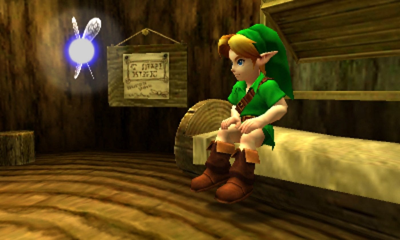
Modal will shout “look at me”, just as Navi did in Ocarina of time: “Hey! Listen!”. In fact, she has been widely criticized by players for her repetitive interruptions in gameplay, especially with this prompt.
The user will have to process them before returning to the initial state. Sometimes, this can be useful, especially when users need to check a crucial action. Most of the time, however, it’s unnecessary and simply annoying.
Modals must be initiated by the user
Best web practices recommend letting a user action, such as clicking on a button, following a link or selecting an option, trigger the modal window.
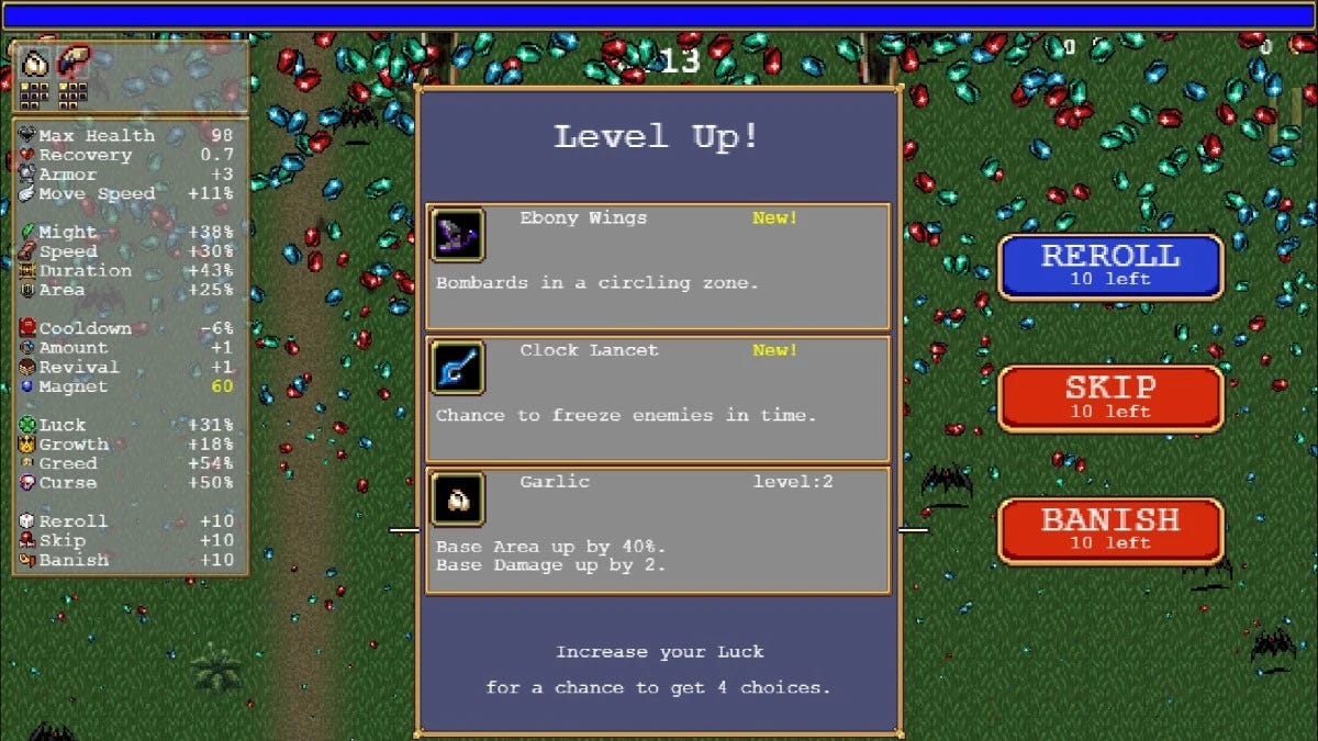
But, we create games, not web page. If you’ve played Vampire Survivor, you’ll know that for every new level reached, a modal window with various enhancements suddenly appears.
This is not a direct action by the user, such as pressing a button, but an indirect action: the accumulation of a sufficient number of experiences resulting from numerous actions in the game.
This means we can suddenly open a modal window if it suits the gameplay.
Anatomy of a modal window
Now that we know when to use them, let’s take a closer look at their essential components.
1. Emergency exit
Remember, a modal window is designed to attract attention. That why, if the action isn’t mandatory, we need to provide users with a means of escape by giving them the option of closing the modal window. This can be done in 4 different ways:
- Add a close button on the top right, often a cross icon
- For keyboard user, push the escape key
- By clicking outside the window
- Add a cancel button
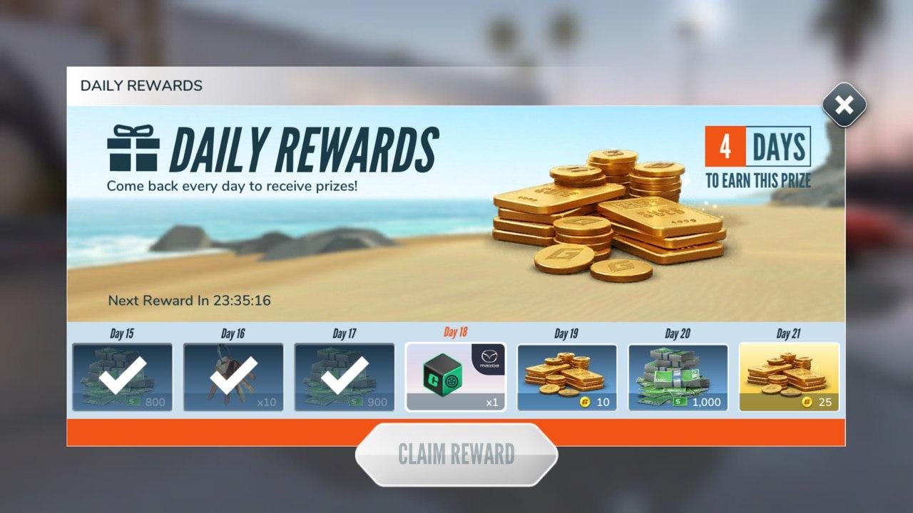
2. Descriptive title
Give your player context – this is the most important information to display. At the top of the modal, use a short, concise title.
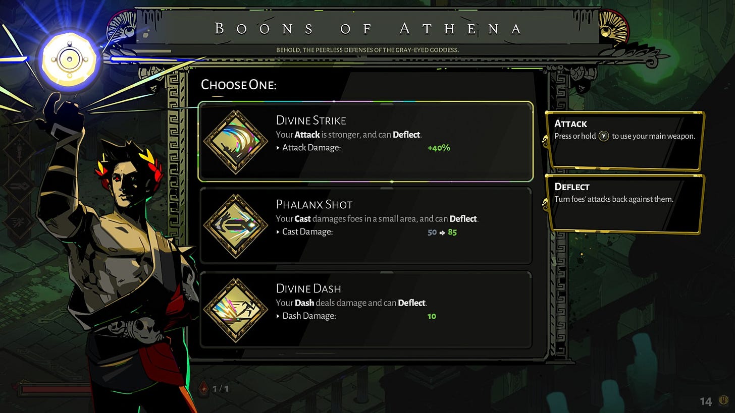
3. Call to action
This element represents the objective of your modal. What the user should do. It usually takes the shape of a button, with an understandable verb for the wording, like “Claim” or “Buy”. Yes, it’s a cliché, but… “make it pop”. Make it big enough, add some color, give it a clickable element design by adding a shadow, a border, a hover effect, etc.
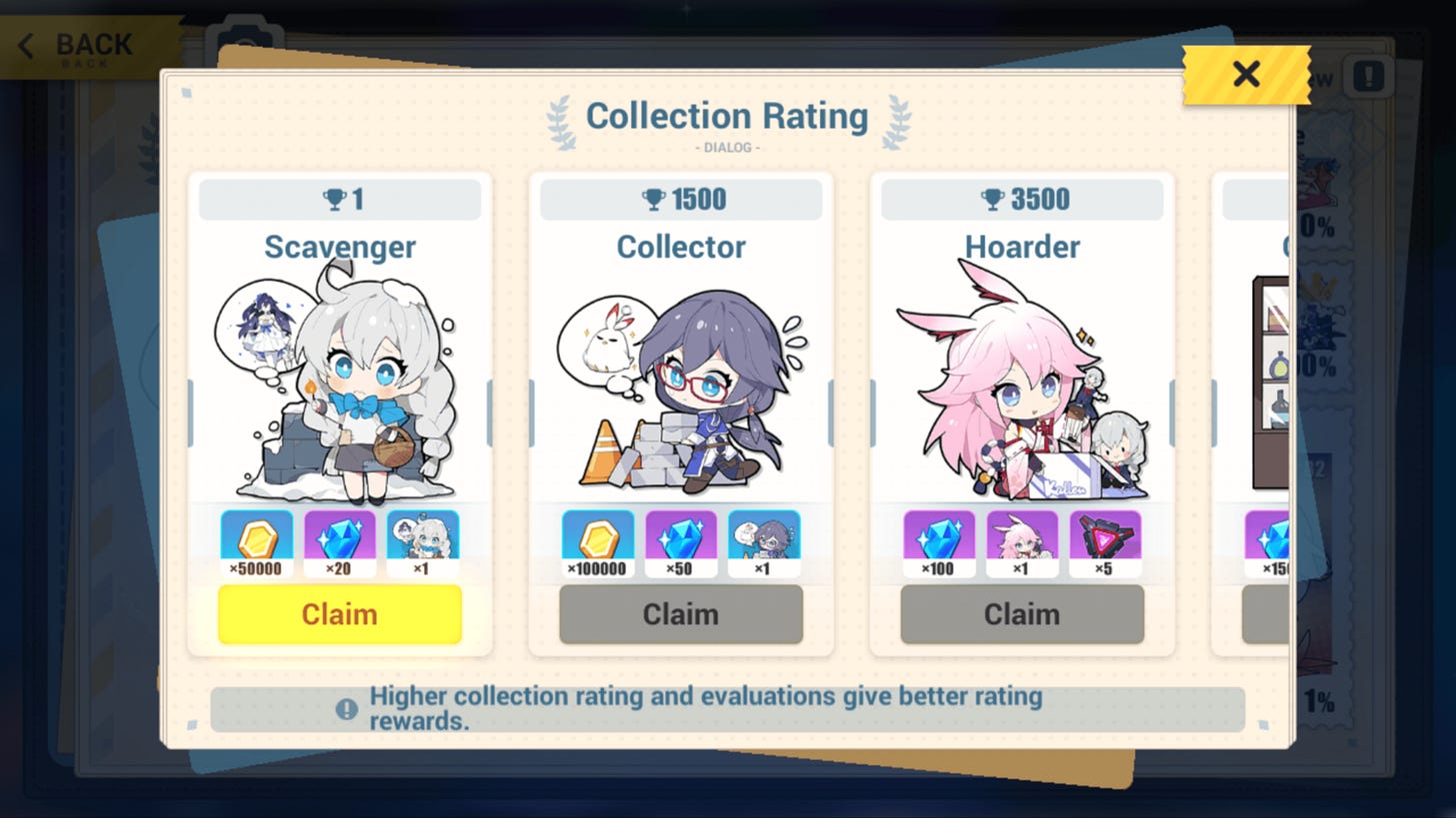
4. Sizing
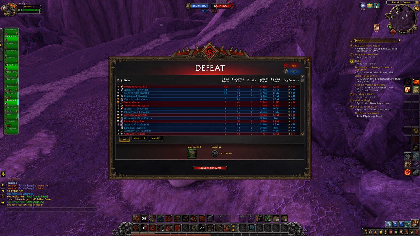
We know that gamers use a lot of different screen resolutions, and it won’t be easy for us to design a modal of ideal size.
If the modal is too small, it will be hard to read and get the focus you need. If it’s too large, you’ll lose the context of the current state. A modal window shouldn’t take up the whole screen, and if you need to scroll, you might want to consider creating a new page.
Taking my favourite game as an example, the modal window looks too small. What’s more, the background is not covered, making it difficult to highlight our new element.
We’ve finished with the most important elements! If your modal catches them all, your players shouldn’t be at risk.
Conclusion
Modal windows can be frustrating, stopping your players in their current tracks and hungry for attention. Used wisely, they can provide or elicit valuable information from users, while respecting best practices in content hierarchy and offering an easy way out.
Source : UX republic, NNgroup, Ux planet & Logrocket
Links worth visiting
- ChipTone – a free tool for generating sound effects
- Maple Forest – explore, make new friends, and face deadly foes in this action RPG!
- The Book of Shaders – a gentle step-by-step guide to the abstract and complex universe of Shaders
- Cool pixel art – Found on a cabinet made over 140 years ago
- The Death of Unity – you should have heard about the scandal
- Dear Unity, You’ve Betrayed Us – if you’re more interested in video
- Slimes fonts – free collection of 6 hand-crafted 2-shade pixel-art bitmap fonts
- Scribble – did I talk about this modern text renderer for GameMaker 2022?
- Pixel art inspiration – teapot house and background in pixel art
- How to pick colors – small color tutorial for pixel artist
You want to share a link about video games, interfaces, game dev or design? Let me know.