#16 – How to make an intuitive navigation?
If your are a bit aware of the new in the video game industry, you likely caught Gearbox Software’s big announcement at Gamescom: Borderlands 4, the king of the shooter-looter genre, is set to launch by 2025.
Coincidentally, I’m currently playing Borderlands 2 with some friends. Even though Salvador the Gunzerker isn’t really my style, I’ve decided to stick with him.
But this is not the point.
The point is: I hate the game’s inventory system.
It feels so unintuitive that, even after 30 hours of gameplay, I still can’t fully grasp how to use it. And it’s not like I’m new to gaming—I’ve played plenty of games and encountered various systems. It’s both frustrating and ironic, considering that loot is the core mechanic of the game, isn’t it?
If you haven’t played it, don’t worry. In this article, I’ll explain why the inventory system doesn’t work and what solutions could improve it.
So, grab a drink, get comfortable, and enjoy!
Games and industry standards evolve over time
Consider that Borderlands 2 was released in 2012—that’s about 12 years ago. Feeling old yet? Don’t worry, you’re not alone.
To give you some context, that same year saw the release of games like Diablo 3, Hotline Miami, FTL, and Journey.
It’s important to keep this in mind as we discuss the interface design of Borderlands 2. My intention isn’t to criticize the game or its designers freely. I love this game, and I understand that there were likely constraints and challenges faced by the designers 12 years ago that influenced their decisions.
That’s what UI design is all about—finding solutions to problems.
As a PC gamer, I might not be the primary target audience for Borderlands 2, and hardware presents a significant challenge in game design. The resources available to players can vary widely, meaning the same problem might require different solutions depending on the platform. And naturally, these decisions can also impact the budget.
What works well with the inventory system in Borderlands 2?
Loot is absolutely everywhere in the game. Kill an enemy? Get some loot. Finish a quest? Get some loot. Walk in the snow? Get some loot. Open the menu? You’re almost getting loot there too.
You get the idea, loot is a core part of the gameplay. The constant hunt for better gear keeps your curiosity at its peak, and you’ll frequently swap out weapons because there’s always something better around the corner.
If you’re a gamer, designer, or developer, you know what this means: we need an effective inventory system, and that’s what we’re diving into today.
Overview of the inventory
Imagine yourself in a cozy chair, soft light reflecting off the walls, your gamerZ RGB keyboard glowing brightly. You press the key to open your inventory, and here’s what pops up:
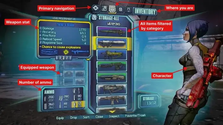
At first, I’m not gonna lie, it looks good:
- Plenty of white-space which give a good focus on what I’m looking for
- The primary navigation is easy to understand, and well-placed on the top
- Ammo counts are directly visible, no extra clicks needed
- A large pop-up appears to display detailed information about each weapon
- The familiar color scheme indicates item quality
- Additional icon (dollar, bullet, weapons, updown arrow, map…) make it easier to understand
- I can even see my character, showing off that new powerful weapon—pretty nice, isn’t it?
- The pop-ups are well-designed, appearing near the item they belong to (remember the law of proximity), and the information is easy to scan
A quick reminder about white space: it’s not wasted space. In fact, it’s great for your interface. It helps draw attention to key elements, reduces cognitive load, and gives the interface a cleaner look.
And hell yeah, even after a second look, it’s beautiful! And as you can see, it’s not all doom and gloom – there’s plenty of good stuff!
Users often perceive aesthetically pleasing design as design that’s more usable
So, what’s the problem with the inventory?!
Borderlands 2’s inventory problem
I still don’t understand why, but have you noticed how hidden my equipped weapons are on the previous screen?
It might be a deliberate choice to add more white space and make the screen less overwhelming for the player, but it ends up making the inventory feel disjointed for no apparent reason.
The real issue is that you can’t view both your equipped and non-equipped weapons at the same time. You have to switch between two panels, with one fading into the background while the other takes focus.
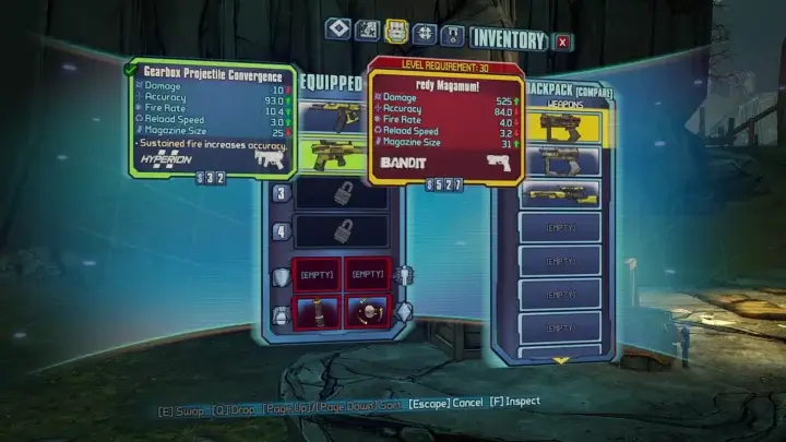
That’s where they lost me. I absolutely NEED to see my entire inventory. Why do I need to see it? Because I always compare or change my equipped weapons with those in my bag.
First point: reduce cognitive load
If your computer is slow, you’ll add more RAM. And if your user is slow? You can’t add more brainpower (maybe in a few years’ time, but not right now, calm down mad scientists).
This is called cognitive load.
Just like computers, human brains have a limited amount of processing power. When the amount of information coming in exceeds our ability to handle it, our performance suffers. We may take longer to understand information, miss important details, or even get overwhelmed and abandon the task.
If this action were very rare in the game, I’d be less likely to notice the friction when performing it. But the reality is different. As mentioned below, the game consists of looting new items, every time, everywhere. Which means I’ll often have to open my bag.
The first thing to do is to reduce the number of actions to reduce cognitive load. Here’s what the task looks like and how it can be simplified:
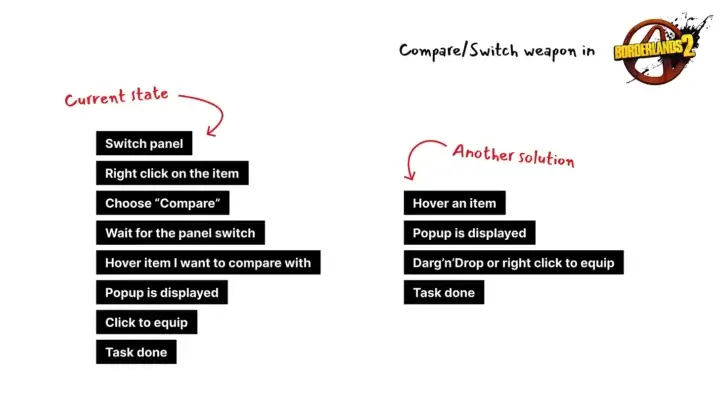
New solution, new problems
The search for a new solution often leads to the emergence of new problems, which must be solved.
In the game, you can have several weapons equipped at the same time, four to be precise. This means that if you want to compare items, you don’t know which one or/and it’s a lot of information to display at the same time: 4 tooltips of the equipped item and 1 of the one you want to compare.
I have two possible solutions in mind:
- Add a key to switch to weapon equipped we’re comparing too
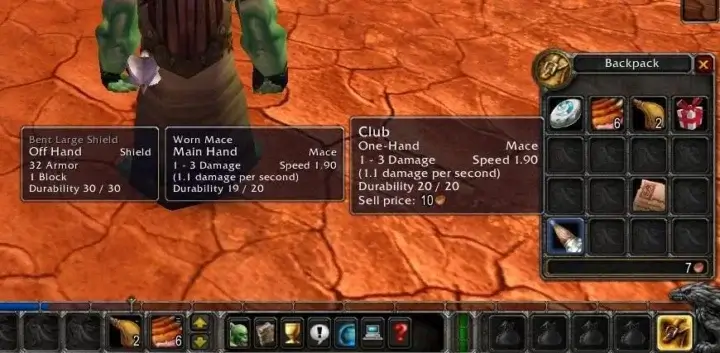
- or like in World Of Warcraft, display everything at once
Second point: Interaction should be faster than 100ms
Have you noticed that I’ve added “Wait for panel switch” as a task in the current state? That’s because that’s how I feel when I use it. The delay is so long that I need to wait for this action to be executed.
When I switch from the first panel to the second, there’s a “big lag” on my *not-so-old* computer.
Maybe it’s a technical issue, maybe it’s something else, but it just doesn’t add up. It’s all the more suspicious because visually, I’m simply switching from my inventory to my… inventory.
Have you heard of the 100 ms rule? If you’ve read the previous newsletter, I know you have. If not, here’s what it’s all about:
The rule states that every interaction should be faster than 100ms. Why? 100ms is the threshold “where interactions feel instantaneous.”
Paul Buchheit
Last point: test, test and… test
I can’t believe they didn’t test the game, if they had they would have seen there was a problem. And if you’re making a game, you should be too. Testing your game is an important and not insignificant part of its design – there are too many things that can be fixed or improved with a few tests.
If you’re interested, I could write an article on how and why you should test your game – and not just your interface.
I haven’t played Borderlands 3, but I’d like to know if they’ve fixed the inventory. What have they done? How does it feel now? If you’ve played it, let me know!
Conclusion
If your game is built around a main mechanism, make sure that all its aspects are well oiled. Little things can call into question the way players use and perceive your interfaces. Having a panel of players ready to test your game and applying a few design rules can save you a lot of trouble.
And of course, it’s always easier to write an article about how to do things than to actually do them.Links worth visiting
- FamiStudio is a simple music editor for the Nintendo Entertainment System or Famicom.
- Track your game, decode the market & discover your next adventure with Vania
- After two and a half years in Early Access, Core Keeper is out now in 1.0!
- I’ll join the Mini Jam 166 this week! Stay update if you want to try my game.
- As you probably know by now, LÖVE is a framework for making 2D games in the Lua programming language.
- Arco – A tactical RPG that blends turn-based and real-time combat is out!
- You can search your favorite game in Game UI Database 2.0 now
- I’ve started making game with my Playdate – here is a good video if you want to know more
You have an interesting link about video games? Let me know!
Bonus:
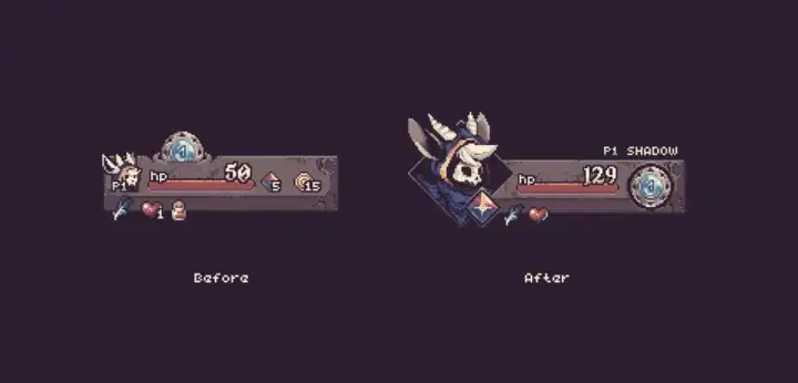
Here is a before/after of our interface for Another Door! After a few modifications to the way information is displayed on screen, we improved the interface available at the bottom of the page. I hope you’ll like the changes 🙂