#12 – What you can learn from the UI Design of World of Warcraft
Last year, we discussed game design user interfaces in general without focusing on specific games. This year, I would love to continue with the current series, where I focus on a specific game in each newsletter.
Previously, we delved into the design of the amazing game Lethal Company: how the interface matches the genre, which colors the creator picked, and how established conventions help your players understand what you did. Additionally, I wrote about the amazing bicycle from Pokémon, and yes, it’s overpriced.
That said, let me introduce the game UI we will analyse today: World of Warcraft.
About World Of Warcraft
The MMORPG released in 2004 by Blizzard, also known for games like Warcraft, Diablo, Overwatch, and Hearthstone, is strong of 9 expansions (nope, I don’t have enough space to list them all here) and played by millions of players around the world: WoW is a monument in our industry.
As you know, I’m a fan of this game; it shaped my childhood, and I’ve continued playing it up to now, twenty years later. I feel like I’m here today because one day I encountered video games like this one, which transcend me.
That’s why today I’m going to give you a list of 6 things World of Warcraft did very well in its UI Design. Take a seat, grab a coffee or whatever hot-sweet beverage you like, and enjoy!
The concept of color-coded loot rarity
A lot of articles have been written about the role, psychology, or impact of color in design. Give it a try, ask your favorite search engine about “UX color”, and you’ll end up with millions of results. And if you’ve ever played a video game with loot, you may be familiar with the concept of color-coded loot rarity.
The concept of color-coded loot rarity was initially popularized with the 1996 game Diablo and its 2000 sequel Diablo II, whose designer, David Brevik, took the idea from the roguelike video game Angband.
The fact that so many game like Borderlands, Torchlight or Guild Wards 2 used the same design pattern, which is widely adopted by players, demonstrates that one of the best ways to help users understand your design is by reusing things that have already shown their value.
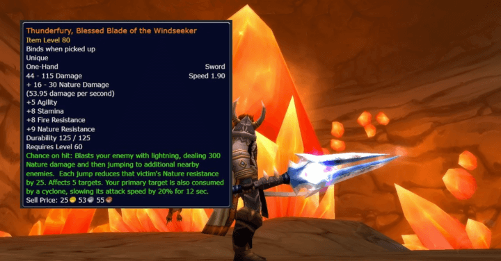
When a monster drops an item in World of Warcraft, you’ll directly know its rarity by the name’s color. Legendary items are orange, Epic items are purple, Rare items are blue, Uncommon items are green, Common items are white, and Poor items are grey.
Oh and while I’m talking about rare item… please, if you have ever looted the famous Thunderfury, Blessed Blade of the Windseeker let me know.
The “Silver Dragon Effect”
I’ve slain thousands of mobs in the game, and besides orange loot, there is one type of enemy that gives me a dopamine shot: the rare elite.
Rare elite monsters are uncommon and often give rare (and valuable) items as their name suggests. This is not a normal encounter; you don’t find a rare every day back in the heyday of WoW. One thing I love in the UI is that they used this design, called the “Silver Dragon,” to beautify the frame when you focus on a rare elite.

They could have just written “Elite” or added a basic star to indicate the type (which they did in the last expansion, and I really don’t get why). Instead, they kept the story and genre of the game in mind and used a wonderful silver drake.
Player senses will be triggered the first time they see this, and once one of these big boys kicks your ass, you’ll understand what that means – a stronger enemy, which means stronger rewards.
This is a simple and beautiful way to keep players engaged in your universe, if you want my opinion. And when your univers is Warcraft, you have a loot of thing to inspire from.
Text with custom color and size for faster recognition
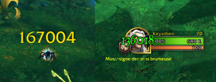
In an MMORPG where the main gameplay involves fighting using various spells, there are many moments where you’ll receive damage, heals, critical hits, or spells all within a short time frame. The game designer handles the display of theses informations as follows:
- Yellow for skills
- Red for ennemy damage
- Green for healing
- Bigger font size for critic
- …
Display skill-related information in the right place
On the next screen, you’ll see how the designers have chosen to display certain skill-related information, such as:
- Skill is loading
- Skill is disabled
- Skill triggers something special
- Skill is available
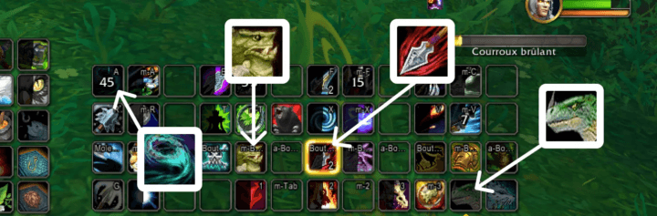
Watch how each of these elements conveys something different while maintaining the same look and feel. You can play with color, shape, text, overlay to change the meaning of an asset.
Most importantly to me is that they chose to display it right on top of the current skill. Remember that an important rule when designing your game interface: proximity matters.
Don’t make users search the entire screen for information that should be displayed right in front of their eyes.
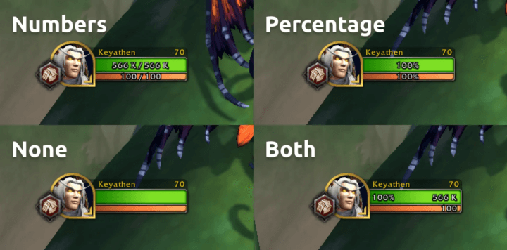
Custom interface settings
This is not a common option in video games because designing and developing different settings takes a lot of time, but it’s a really good feature. Allowing players to choose their favorite way of displaying things while maintaining control over how the final result looks is a nice addition to your game.
Look at how I can switch between these four options: numbers, percentage, nothing, or both.
UI architecture
This tip, in my opinion, is fundamental to UI design. Information architecture is a crucial and often underestimated aspect when designing interfaces.
Believe me, you don’t need bold, bright text blinking everywhere. Keep your screen clean.
First, WoW designers display spell information only when the user hovers over it. Then, they present them in the right order: Name (1), Important detail (2), Description (3), Less important detail (4). How did they achieve this? Colour, contrast, font size and position, that’s all.
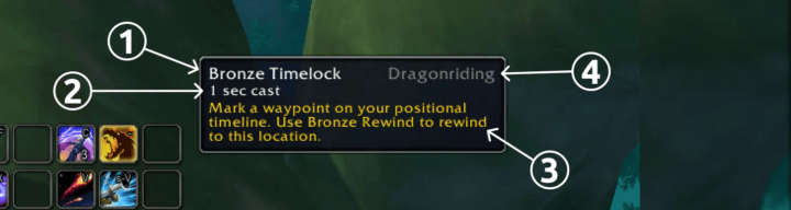
As a French player, I read from top-left to bottom-right, something that the designer kept in mind while making this tooltip. Also, you can see how “Bronze Timelock” is brighter than everything else and how “Dragonriding” is darker than the rest of the screen. I suppose this is the first and last information the designer wanted to show me at this moment.
Thanks for reading; I hope you’ll find these tips useful for your own game. If you want to keep them forever with you, grab this image I’ve made specially for you.
Links worth visiting
- 100k Wishlists in 2 weeks after Steam Page went online – the story of Outbound
- Designing Games for Gamers with Disabilities by Game Maker
- How to make money with your indie game? – A french video by Game Dev Alliance
- Any fan of Pokemon here? Yes? Then admire this poster.
- AMA from localthunk developer and artist for Balatro
- This page helps you choose the right easing function
- Stardew Valley 1.6 Changelog
- Looking for a publisher? Follow this Publisher Database link
You have an interesting link about video games? Let me know!