#17 – The edge case of user interfaces design
Have you heard of the Pareto principle or the “80-20 rule”?
In a nutshell, this principle states that 80% of results are due to 20% of causes. If we apply this law to design, we can say that 80% of the work is due to 20% of the designs. Whether this is true or not, I like to think of this 20% as the edge cases of our game’s interface.
“80% of outcomes are due to 20% of causes” – Pareto principle
Take a design screen we’ve all seen before in a game, like the talent tree.
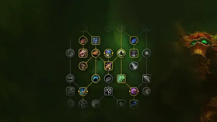
Here is 80% of what players will see when they open their talent tree:
- The talent is active
- The talent is inactive
This is what the vast majority of the design will look like. But what about the 20% that players might see, but that we still have to create?
- The talent is disabled
- The talent is only 50% active
- The talent is loading
- The talent is hovered
- The talent has multiple choices
- The talent is pressed
…
I call these the edge cases of design, the 20% of the Pareto principle. The reality is that they are just another UI state, like any other.
In this article, we will dive deep into the conception of these little time-eaters, why we need them, when we do, and how many there are.
Grab a drink, and learn something new with me today.
Enjoy!
What are the different user interface states we need to design?
Ideal or Default state
With ideal data and perfect contact, this is what your screen or component should look like to your players. Unfortunately, many designers only design for this one state.
Look at this screen from Advance Wars 2 — this is what an ideal state looks like: clean content, no disabled items, and not a single error in sight.
Disabled state
I haven’t played Outriders myself, but just by looking at this screen displaying some skills, I can easily identify the disabled state of certain elements.
While I’m not a big fan of the “disabled button” when browsing websites—due to the lack of feedback they provide to the user—it’s a totally different experience when playing a video game.
Unlocking elements is a common way to reward players, and this state is very welcome as it conveys a sense of progression.
Empty state
An empty state occurs when there is no data or content to display. Its purpose is to prevent players from feeling confused or stuck. Instead, it should:
- Inform and set expectations: clearly communicate why there is no content.
- Guide the user: offer guidance or actions to help users move forward.
Take a look at the auction house in the free medieval fantasy MMORPG Albion Online. If a search doesn’t return any items, here’s what is displayed:
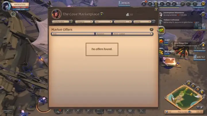
“No offers found.”
Yes, but why? And how do I change that? It’s not bad, but it’s not enough.
More guidance, like a button to reset the search, or an explanation such as “No offers found for your search ‘Another Door’” would be a nice addition to help players.
One thing you should avoid is blaming the player. Instead of writing, “You made a mistake in your search” try “It looks like the search was unsuccessful”.
Small differences, big impact.
Nothing state
This one is a bit different from the empty state. Here, the lack of data is temporary, and it acts more like an idle screen.
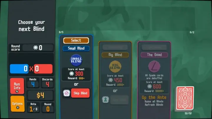
A good example comes from the game Balatro, a poker-inspired roguelike deck builder, where you have a space for cards called “Joker.”
This space is located at the top of the screen, and referring to the screen below, you can see that there is currently nothing in it.
Unlike the previous state, users can’t change that at the moment.
Error state
Unlike an empty or nothing state, which are often neutral or expected, an error state indicates a problem that needs attention. This state is frightening, because errors are often perceived in a negative light.
Let’s try to change this mindset a little. How can we do this?
- By providing information or steps to solve the problem. Not just an annoying “An error has occurred” message.
When an error occurs in Heartstone, a quick strategy card that needs no introduction, the message explains what needs to be done to solve the problem: “wait a few minutes”.
What if the error happens again and again? I don’t know, but they might have a message with more information like “Try contacting support”. It would be a good addition to avoid being stuck without information.
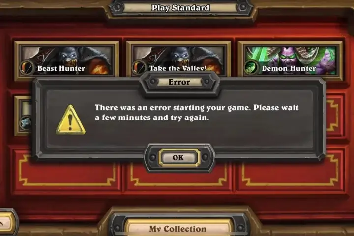
⚠️ This state is a bit special because error have very few chance to happen is your game is playable by a single player and offline. You know, theses littles bug linked to the joys of online gaming and the Internet
Success state
The little brother of the error state. In video games, it occurs in two ways: to validate player input – it’s linked to online functionality – or to signify success in the game.
Validate the player input
This first case requires less text and indications than the error state. It can be represented by a well-known and easily recognizable icon, such as the green mark.
Signify an achievement in the game
The difference is easy to see in Overcooked 2, between the level on the left with its three stars indicating success or completed progress, and the level on the right with its greyed-out star clearly indicating that it has not been started.
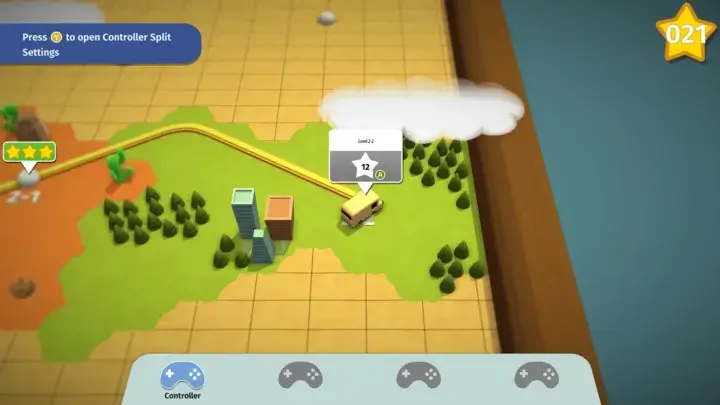
One, Some, Too many states
The main objective is to create a flexible, dynamic user interface that adapts seamlessly to different levels of content. This ensures that the design is clean, remains usable and provides appropriate context or guidance depending on the amount of data available.
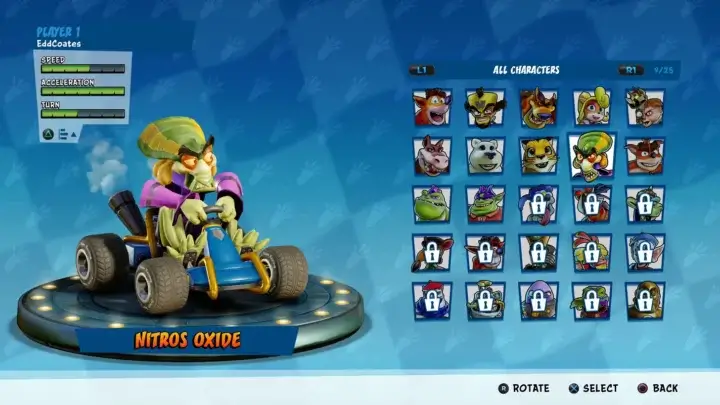
These three states can be found in different cases such as: inventory, auction house, level selection, talent tree… Or characters selection, like this screen from Crash Team Racing.
I can link my own article for “Too many” states, where we’ll often end up making a pagination, and a good one.
Hover, Pressed, Focused, Selected, Activated, Dragged states
I can’t describe each of these states in such detail, or I’d have to write a novel.
They are directly linked to components or interactive elements, where player action is possible. They may one day have their own article, but in the meantime, here are a few tips to help you:
- Take a look at Twelve basic principles of animation introduced by the Disney animators Ollie Johnston and Frank Thomas
- Learn what easing is
- I’ve already write about it in this article: #8 – Better-designed buttons!
- … and if you have any questions, I’ll be happy to answer them 🙂
Conclusion
Take this list as a checklist when you make your UI, and check item by item to make sure you’ve created everything you need to make your game understandable!
- Ideal or Default state
- Disabled
- Empty
- Nothing
- Error
- Success
- One
- Some
- Too many
- Hover
- Pressed
- Focused
- Selected
- Activated
- Dragged
It happened to us
Working on our upcoming game, Another Door, we have a wonderful example of this principle that I mentioned at the beginning of the article. The vast majority of monsters in the game have two distinct choices, designed as the left card and the right card.
But… some monsters, 5 out of 26 to be exact, required a specific design due to their atypical gameplay.
And do you know how many percentages 5 out of 26 represent? That’s 19.23% of the encounters we have in the game… Have you heard of the Pareto principle or the “80-20 rule”? No ? Well, loop is looped.
Links worth visiting
- Tiny Glade a small diorama builder where you doodle whimsical castles, cozy cottages & romantic ruins is out! And here’s a video to understand why and how it’s so beautiful.
- Nintendo is patent trolling Palworld because it got too big
- I discovered the wonderful world of shaders. Special mention to Xor for his tutorials on the subject!
- I’ve participate to the Mini-jam 166, here is My Dear Humans and it’s original OST
- Shroom and Gloom is a first-person, roguelike deckbuilder that brings you mobs of monstrous mushrooms and mountains of mega-combos!
- Monito Adventures – A pixel art short film animation blender
- GMEXT-Twitch – A repository for GameMaker’s Twitch Extension
- Pyrene is out! Defeat hellish monsters and rebuild your home in Pyrene, a fast paced roguelike dungeon-crawler.
- Embark on a journey across a Sci-Fi Provence-like world with Caravan SandWitch!
- Our Discord is ready to welcome future players to try out the game when we have a demo.