#15 – Make your game’s interface clearer
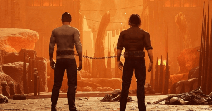
Recently, I played Chained Together, a video game in which you climb chained to your friends through various worlds to reach the top and discover what awaits you there… Beside the gameplay, which is really cool, I was impressed by the minimalist inteface.
The game allow only few actions such as jumping, moving or pulling – but poor design choices can lead to a busy interface. How can a game convey all the information to players without overwhelming them? That’s what we’ll try to understand in this article.
Grab something to drink and enjoy!
Why it’s important to have a clean UI?
According to Miller’s Law, the average person can only retain 7 (plus or minus 2) items in their working memory. This means that your players won’t remember the quest log, the number of gold or the key on the keyboard to drink that health potion. It’s simply too much for our brains.
And this is the reason User Interface design exist, isn’t it? To help us.
But… if you play a video game, you may already have that feeling that there’s too much information displayed on your screen at the same time. And what should have been there to help just becomes noise.
Let’s define in a few points why it is important for your user interface to be clean, once you get past the “I don’t understand visually” part, it will:
- Enhances usability
- Facilitates task completion
- Give a competitive advantage
And I’d like to make it clear that a clean interface doesn’t mean a minimalist one. Sometimes you can’t have a minimalist interface.
Now let’s dive into the creation of a game interface that will support the player’s action, not lose it.
Limite the number of option
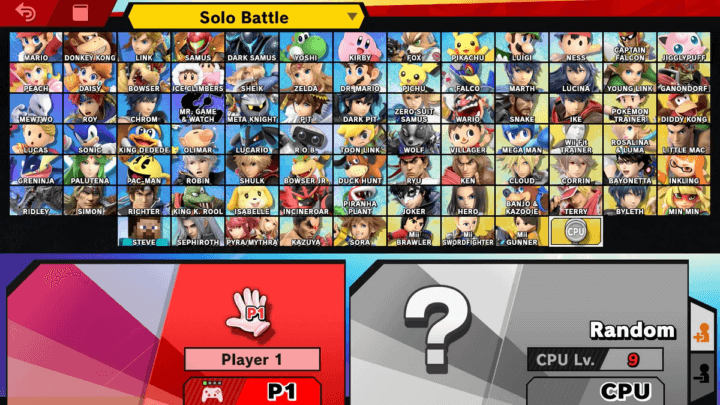
Have you ever walked into a restaurant, opened the menu and couldn’t choose something because there were too many choices? Option overload can actually lead to us not making a decision at all. It happen when I open Super Smash Bros character selection, with more than 80 choices I’m glad the game designer add the random option to save me…
I’m lying, I’ll always choose Luigi. ✊
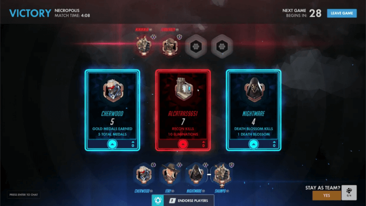
Now look at this screen from the amazing Overwatch.
At the end of the game, you have the choice of rewarding a player based on skill, kills, assist or whatever the Overwatch designer chooses to display. What’s interesting is that the number of options is limited to three. They could have put a lot more option on this screen, but they didn’t.
At this moment, having fewer choices won’t impact on the user experience; on the contrary, it’s a smart way of keeping the interface clean, understandable and usable.
Visual hierarchy
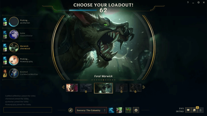
If you’re one of the 140 to 160 million monthly active users of League of Legends (don’t tell me you don’t know this game), you’re already familiar with this screen. The fact is, the UI designers have done a great job, and the visual hierarchy is perfect.
Visual Hierarchy: Refers to the organization of the design elements on the page so that the eye is guided to consume each design element in the order of intended importance.
The first thing you notice? A large image of your champion followed by the title “CHOOSE YOUR LOADOUT”, which couldn’t be clearer. Then you’ll notice the skin, the skill, the allied champion and so on.
This lets users know where to focus their attention, avoiding flashiness and emphasizing the important elements.
Prioritize information
That’s what an inventory is made of. When the information architecture is well designed, it’s easy to find what you’re looking for.
Information architecture (IA) is the discipline of making information findable and understandable. It includes searching, browsing, categorizing and presenting relevant and contextual information to help people understand their surroundings and find what they’re looking for online and in the real world.
Imagine a game where the entire inventory is visible 100% of the time. It make no sense for 99% of games. Now apply this logic to every little item of your UI Design. Does this button belong on this screen, at this precise moment? Is this text as important as it first appears? Can it be placed in a sub-menu? Should it be?
Ask your players, feedback is important
It can be hard to choose, my advice is to ask for feedback. Start an alpha, beta, demo or whatever you call it and get some.
This is the best way of understanding what your players are looking for and how you can solve their problems. And if you think you can do it alone, just a small reminder that your are not the user, which lead us to our next point: user plain language.
Use plain language
If you’ve spend time making a good game I know it take a lot of effort, and you can be proud of what you’ve made. But here is something to not forget, you know your game more than anybody and the language of your game, the one you’ve created, belong to you only.
Your game can talk about a difficult subject in a simple way
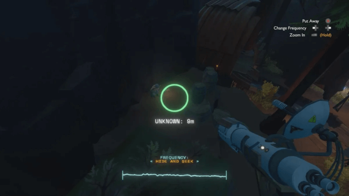
Look at this screen from Outer Wilds, the last game I’ve played (and you should play it too!) where the designers use plain language to indicate actions you can make.
Even if you didn’t played it you understand what “Put away”, “Change Frequency” or “Zoom in” does. This is simple wording, easily understandable by everybody even for a game about supernova, spaceship and black hole.
Tutorials can be obsolete in the long run
I know tutorial are here to help player (and I hate them, we will talk about it one day), but what happen if your users re-open the game one year later? Do you think they’ll know what your very specific niche wording is for? I’m not sure.
Use visual clue
A picture is worth a thousand words, this is the picture superiority effect.
The picture superiority effect refers to the phenomenon in which pictures and images are more likely to be remembered than are words.This effect has been demonstrated in numerous experiments using different methods. It is based on the notion that “human memory is extremely sensitive to the symbolic modality of presentation of event information”. Wikipédia
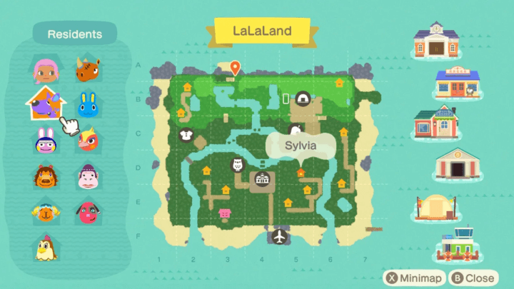
That’s why it’s a good idea to use images whenever possible. A map, for example, is where you can use them. Looking at the Animal Crossing map, I know directly where my character and the airport are, without needing words.
While adding an image to support your text is a good solution, the image alone can be difficult to understand. If you look at the other icons on the map, you can’t be sure exactly what they’re for. To use with caution.
Challenge your interface
May sound stupid but… take a step back and challenge your own interface.
Is every element on the screen essential? Chances are the answer is no. Examine each element of your interface to assess its relevance to the user. As indicated below, you should conduct user tests and consider installing behavior analysis software.
And remember:
- If you can’t justify an item’s prominence, shrink it
- If you can’t justify its existence, kill it
Yep, it’s brutal.
Now let me give you a quote from writer, poet, journalist and aviator Antoine de Saint-Exupéry (cocorico 🇫🇷), this is what I’m trying to achieve everytime I make an interface.
Perfection is achieved when there is nothing left to take away.
Antoine de Saint-Exupéry
Conclusion
You have the power to change the way people perceive your game’s interface, from noisy to clean and efficient. The best advice you can give is not to rely solely on your own judgment, but to listen to your players’ feedback. Try, send, improve and try again – don’t wait too long to test your game interface!
Links worth visiting
- Figma defaults to train AI models on personal data
- 400+ Sprites, Sound effects and new tilesets, the first collaboration between gamemaker.io and kenney.nl
- 68% of players won’t see the end of your game, so make it shorter
- From concept to 4k wishlist in less than 2 months
- I’ve tried Dark and Darker and I’ve so many thing to say on the UI
- The cozy game SUMMERHOUSE sold 200k units
- Make the Trailer Before the Game: A Marketing First Way to Prototype
- The Art of Hades II with Supergiant Games’ Jen Zee
- Escape From Tarkov Puts Bounties On Cheaters, Rewards Players For Reporting Them
You have an interesting link about video games? Let me know!
Bonus
We’ve been working on the music for our game, Another Door, which has surpassed 2,000 wishes 🎉. And since I can share a bit of audio in this newsletter, here’s “Black Dawn”, one of the very first songs from the game, produced by Guillaume Mourier.
If you like 8bit video game songs, this one’s for you.