#14 – How to fake faster loading times with design in your video games?
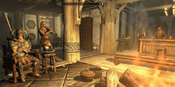
I was talking about Skyrim with a couple of friends last week and they were complaining about something: loading times. They were saying “I have time to make a coffee before the game has fully loaded the new area” or “Sometimes I avoid going into the inn ‘cause it takes too long”.
Damn. I love Skyrim and I’m sad that this makes the gaming experience less enjoyable. While I don’t think the game itself is the problem – the hardware plays a big part here – I want to show you how we, as designers, can fake faster loading times. Like this story about mirrors that reduce the perceived waiting time in elevator.
Why fast loading time is important?
First of all, let me say it again, as UI designers we have little impact on the code itself, sometimes there’s nothing we can do about it. Do you know the story of a gamer who reduced GTA’s loading time by 70%? Looking at the reactions of others players, you can see how painful it is to wait when you just want to play the damn game.
4 years ago, I’ve given a talk about it (in French, sorry for those who don’t speak baguette) explaining that 11% of people would scream on their phone and 23% would throw them if they had a performance problem.
Oh and, did you know that back in 2006, Amazon found that every 100ms in added page load time cost them 1% in sales?
Also, I remember playing Little Nightmare on my Nintendo Switch and the loading times were… a little nightmare. I think I was the only one who thought that, check out this review I found on the internet.
The loading times between each death is around 20-30 seconds. […] Repeating the same areas in this manner and being coupled with the loading times is the wrong kind of frustrating.
Finally, according to one statistic, a person who has been driving for 50 years will have spent nearly 20% of that time waiting at a red light. Real-life loading screen seems crazy, doesn’t it?
OK, you’ve got it, better performance generates more revenue, offers a better experience, produces positive feedback and includes faster loading times. That’s why it’s important.
What can designers do about loading times?
We don’t have hand on the code, but we have mouse on the pixel, which mean we can affect load time by:
- Reducing polygon count of your models
- Minimizing texture resolution
- Using the same object multiple times
And many other solutions, which are just as important as optimising the code that runs the game. But that’s not what I want to write about today. No, in this article I’m going to explain how to fake a better loading time.
Help players to stay or go in active mode
Do you know how players perceive time? According to The New York Times : “People in waiting mode overestimate waiting time by 36%”. Remember the mirror in the elevator? Our goal is to help players to stay or go in active mode.
First, you can follow theses few rules for our waiting screen depending the expected loading time:
- Less than 0.1 second, this is considered instantaneous, just display the result
- Between 0.1 and 1 second, do not try to “fill that time”
- For waits longer than 2 seconds, use a looped animation
- For waits longer than 10 seconds, use a progress bar
- Don’t use static loading messages, make sure they are dynamic and contextual
For anything that takes less than 1 second to load, it is distracting to use a looped animation, because users cannot keep up with what happened and might feel anxious about whatever flashed on the screen – via NN Group
Knowing that, let’s deep dive into each elements.
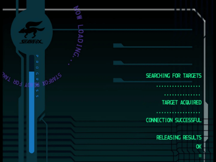
The spinner
I love how Dead Cells designed their spinner, the game’s pixel art style is so compelling and beautiful that it would have been a shame not to take advantage of it for the UI assets.
The progress bar
I did some research about progress bar and… did you know that its design has an impact on how time is perceived? Yep, I’m not the one saying it, this study does.
Progress bars with animated ribbing that move backwards in a decelerating manner proved to have the strongest effect. In a final experiment, we measured the effect of this particular progress bar design and showed that it reduces the perceived duration among our participants by 11%.
It’s up to you to rework your progress bar, that’s the kind of work UI Design does, I suppose, reworking things.
The waiting message
A good example of a message are thoses I’ve read back in the day in World Of Warcraft. According to this post on reddit, it looks like some users benefited from them, which means they read them, and therefore spent less time waiting for the game to load… Goal achieved, right?
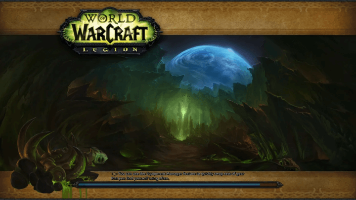
Oh! Do you remember the last article? Be consistent. Give me good looking elements that match the aestetic of your game. Make it memorable! You know… devil is in the details.
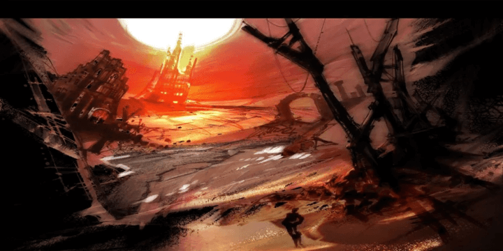
The artwork
I’m a huge fan of Guild Wars 1, and one thing that stood out for me was the artwork from the loading screens. These artworks were magnificent and I spent a lot of time looking at the details.
Instead of just a plain black screen, you can display an artwork or a beautiful screen from the game. You’re just one image away from inspiring people, so… do it.
Thanks to these elements, you have a number of ways of ensuring that the user remains in active mode, giving the impression that loading times are faster.
Understand user flow to enhance experience
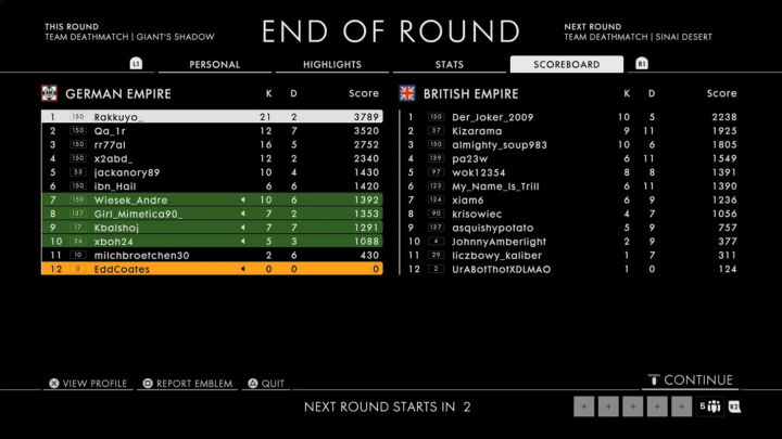
Have you ever played Battlefield 1? At the end of the game, you’ll see the leaderboard screen. With up to 64 players in the same battle, depending your internet back in time it can take a while for the full list to load.
That the typical moment you can use a skeleton screen.
A skeleton screen is a design pattern used to indicate that a page is loading while providing users with a wireframe-like visual that mimics the layout of the page. – Nngroup
Thanks to their knowledge of the user and the flow of the game, you can use a screen skeleton before displaying information. You’ll be able to display the page you want instantly without a loader.
Conclusion
That’s it! With this article you’ve learn how players perceive time and what you can do as an UI designers to create a better experience.
I hope this article has been useful for you, there’s bound to be lots more to say on the subject, and if you know anything about it I strongly encourage you to share it in the comments!
Links worth visiting
- Cairn – Reach a summit never climbed before in this survival-climber
- Dire Deck, or when your game is stolen…
- Meta is about to start scraping your images to train its AI, that’s why I’m on Cara
- Are you planning to take part in GMTK Game Jam 2024?!
- Older gamers are a growth opportunity for AA(A) publishers
- Story time – “We got over 60k wishlists in 6 months. This is how.”
- While my game almost reach 2k whishlist, but I’m more than happy
- asobu Indie Showcase, two hours of discoveries of mainly Asian independent games
- Seven great tips for marketing your indie game on Tiktok
You have an interesting link about video games? Let me know!