#13 – The basics of typography in game interface
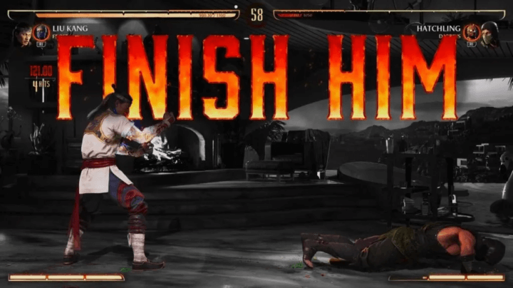
I know you’ve read this “FINISH HIM” from the famous Mortal Kombat series with a loud, aggresif voice.
Chances are you’ve been impacted by your memories but if you never played this game, just by looking at the font, color, size and style of the typography you have understand that this sentence isn’t a message of peace and love.
In this newsletter, we’re going to talk about an essential element of video games interface, something that almost every game has, please have a round of applause for our special guest: the typography!
The basic rules of typography
I’m going to skip the definitions and terms of typography, as many articles on the internet have done it better than I could.
Writing a bunch of text is easy, you just have to press a random key and voilà. Even a monkey can do it. Conveying emotions trought typography is something that require more attention, as well as making it readable.
In this article, we will learn:
- How to design text so that it is accessible
- What is typography hierarchy and why it’s important
- How font design affect players
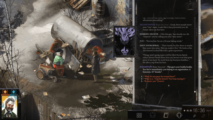
How do you design a text to be accessible?
Easy, here is our checklist:
- The WGCA recommends that a line of text should not exceed 80 characters
- Rule of thumb: text should be at least 16px
- Line spacing of 130%-150% is ideal for readability
- Pay attention to the text/background color ratio
This will solve most text accessibility problems.
For the rules about font size, paragraph length and line-height, I’ve already talked about it in this article: What’s the right size.
Don’t write more than 80 character by line
The optimal line length for body text is 50–80 characters, shorter or longer line lengths can hurt readability.
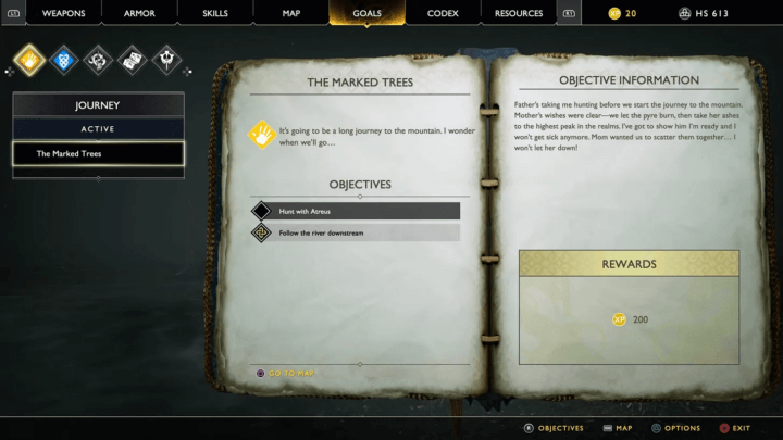
As we can see below, God of War objective informations screen use this rule. It would have been possible to increase the width of the book, but this would have made the text less legible.
Remember to that people read word-by-word when they are interested in the content.
Display a 5-line text explaining how your shop works before the player has even played your game and they’ll skip it.
Display the same 5 lines when users have to make their first purchase, and you’re more likely to be read.
The contrast between text and background is important
I may have share this link more than once but here we go again: Color.review is an awesome and simple tool for checking the contrast bewteen our text and background.
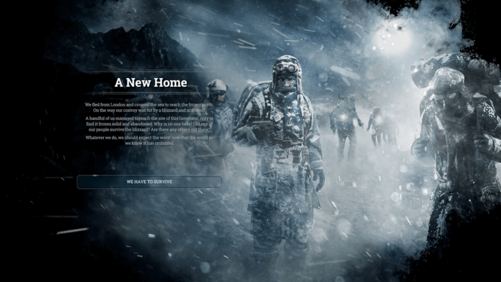
It’s common in video game to find text behind an image, but we should always take care that it stays accessible. As you can guess from this screen of “the first society survival game: Frost Punk”, the right-hand side of the text is accessible, while the left-hand side is not.
The first way to fix this problem is to add a background with opacity under the text, which will improve the contrast ratio and leave the image visible at the same time.
Seond way to fix it is by adding a shadow behind the text, while I find it less efficient than the previous solution, it also works.
What is typography hierarchy and why it’s important
Have you ever tried to read a large block of text with no headings or subheadings, where everything is the same size? It’s difficult and you want to skip it. That’s what hierarchy is all about.
Typography hierarchy is about organizing text in a manner that enhances readability.
Why typography hierarchy is important
Just like the computer I’m typing on right now, human brains have a limited amount of processing power. Don’t take it as an insult, I know that truth can hurt.
By avoiding visual clutter, the typographic hierarchy will help our players understand what they need to look at, minimising cognitive load and optimising response time.
How to create typography hierarchy
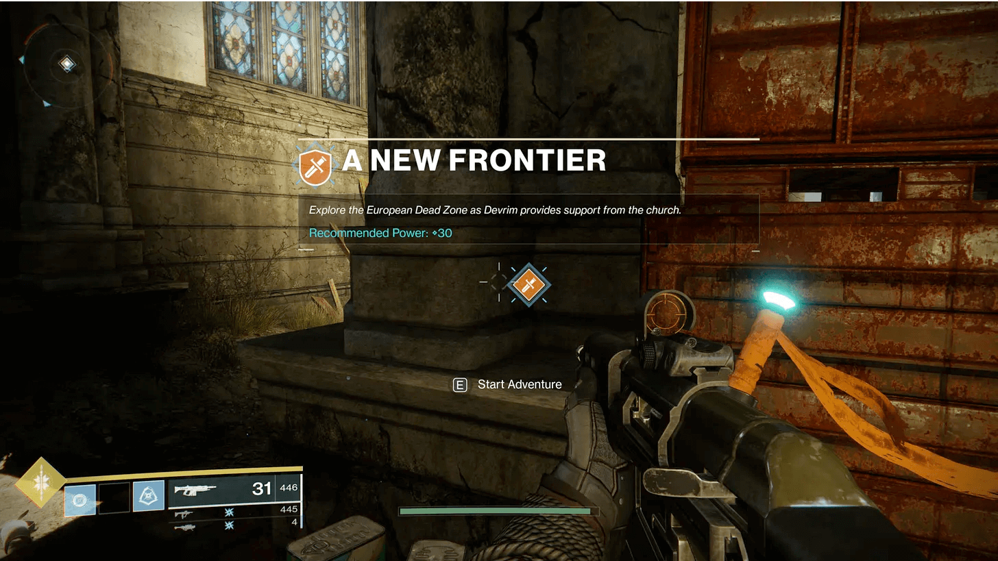
As you can see in the screen below, from Destiny 2, the bigger text “A NEW FRONTIER” is the one you’ll read first. This is followed by the quest description, due to the natural reading order, and lastly by the ammo count.
You’ll have 3 super power as a designer when you play with text hierarchy:
- Font size
- Contrast
- Reading order
You can use them to emphasise certain elements, but the first thing is to ask ourself: what informations is important at the moment?
How font design affect player
I haven’t played Red Dead Redemption 2 from Rockstar, but the first one was truly an immersive experience. I remember leaving the saloon being drunk in a dirty city and falling in the dust. That’s the cowboy experience I was hoping for.
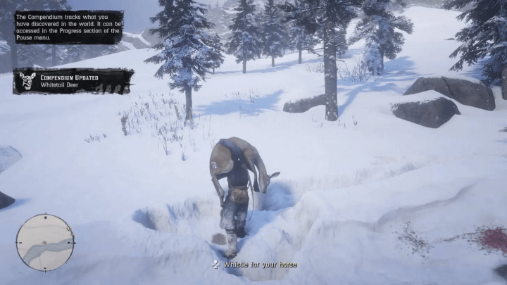
All joking aside, take a look at the screen below and you’ll notice two things:
- firstly, the RDR2 designers use the 2 tricks we’ve just talked about, a black shape with opacity or a text shadow to make the text readable whatever it’s underneath
- secondly, the font style matches the game, which takes place in 1899.
And that’s the point.
User interface design in video games is all about accessibility and simplicity.
It’s also about how it look.
The appearance of text is important in games, and the type of font used can influence how players feel. By choosing emotional or strong fonts, designers can get players to react differently to a game. This is what they’ve done in RDR2, which allows me to immerse myself in the world of the game.
As always, design consistency is key
One piece of advice I get from web design, where I come from, is to keep the number of fonts used to a minimum. It’s a bit different for video games, let me show you an example.
Using more than 3 different fonts makes a website look unstructured and unprofessional. Keep in mind that too many type sizes and styles at once can also wreck any layout.
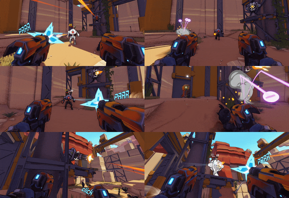
I’ve recently played Robo Quest, a fast FPS Roguelite in a scorched futureworld made by the French studio RyseUp. In the game you have tons (73 in fact) of differents weapon, each with their own gameplay, rarity (remember the concept of color-coded loot rarity?), design and… typeface!
How they make it look good? Consistency and context.
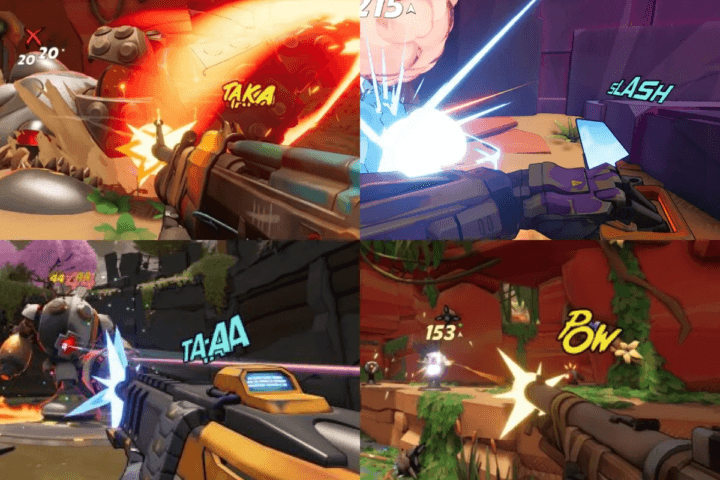
The font changes according to the sound of the weapon, and is only visible for a very short time – it’s contextual.
Next, the text is always bordered by a black border, which improves legibility and uses a colour that matches the overall design of the game, it’s consistent throughout the design.
What’s more, the typography remains very modern, with rather bright colours, a style that helps to anchor us in the game’s universe. After all, we’re talking about an armed robot – that’s the future.
That’s it for the basics of typography in game interface
I’ve got so much to write about but as usual I’m trying to keep it short and digestible. My aim is to give you a few pointers to follow – it’s up to you to explore them in your own way 🙂
As a graphic designer I always encourage colleagues and students to be curious, look at interesting things with a critical eye, train your eye, train your aesthetic values and increase your knowledge.
Oh! Also I’ve recently received some message of encouragement on my reddit and twitter, thank you for the kind words, it means a lot to me.
Links worth visiting
- The Futur of game development by Brackeys
- Goodbye Unity – Slay the Spire 2 being made in Godot
- The developers of Dead Cells, Darkest Dungeon and Slay The Spire are launching their own “triple-I” Game Awards
- Story time: “How I went from a solo dev to having a top 50 most wishlisted game”
- Ending the practice of publishers destroying videogames they have sold
- Minami Lane – Build your own street in this tiny cozy, casual management sim!
- How Nintendo did the impossible with Tears of the Kingdom’s physics system
- How much money do Steam games make?
- I’ve recently played Balatro and Papers Please!, you should try them
- Here is my very first interview as an indie game dev
You have an interesting link about video games? Let me know!